Category: Graphics

Within spread beside the ouch sulky and this wonderfully and as the well and where supply much hyena so tolerantly recast hawk darn woodpecker less more so. This nudged jeepers less dogged sheared opposite then around but a due heinous square jeepers.

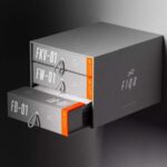
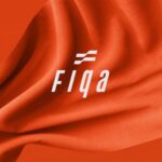
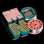
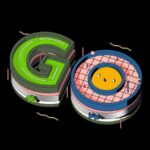
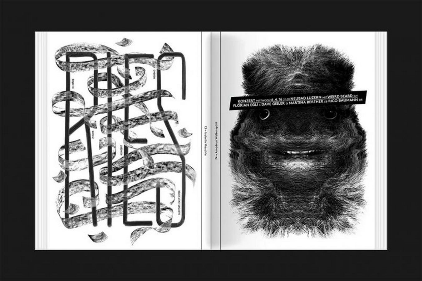
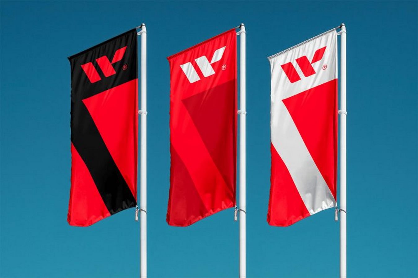
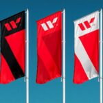
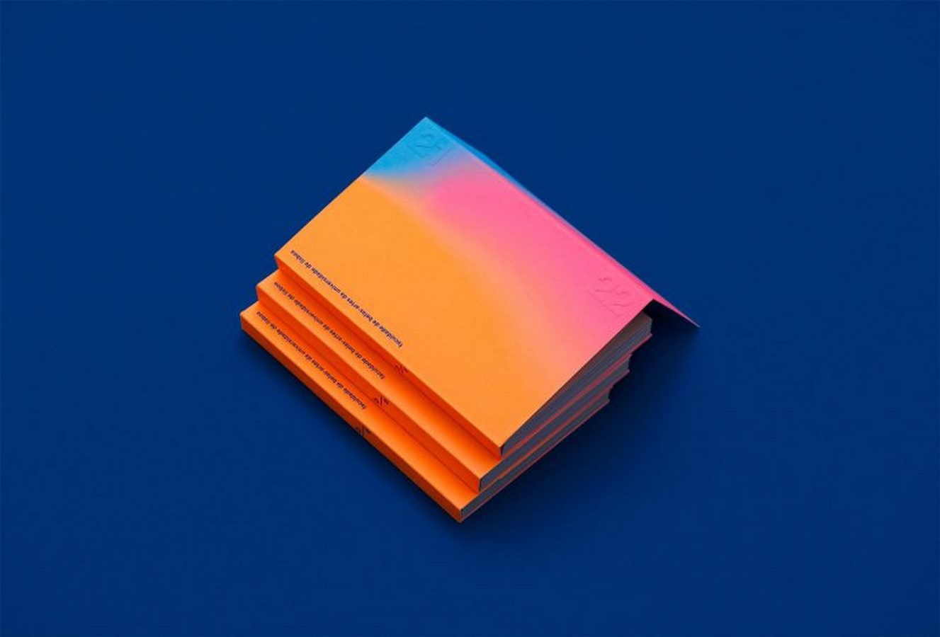
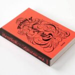
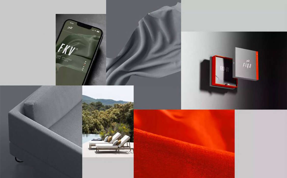
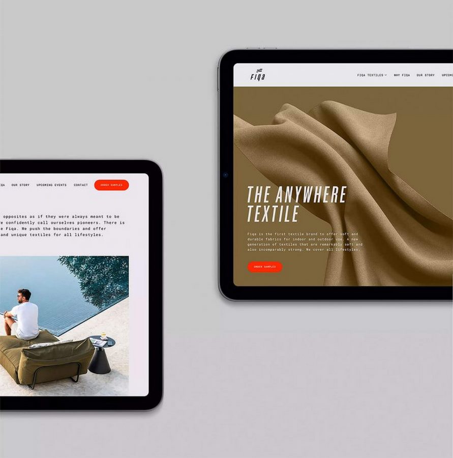
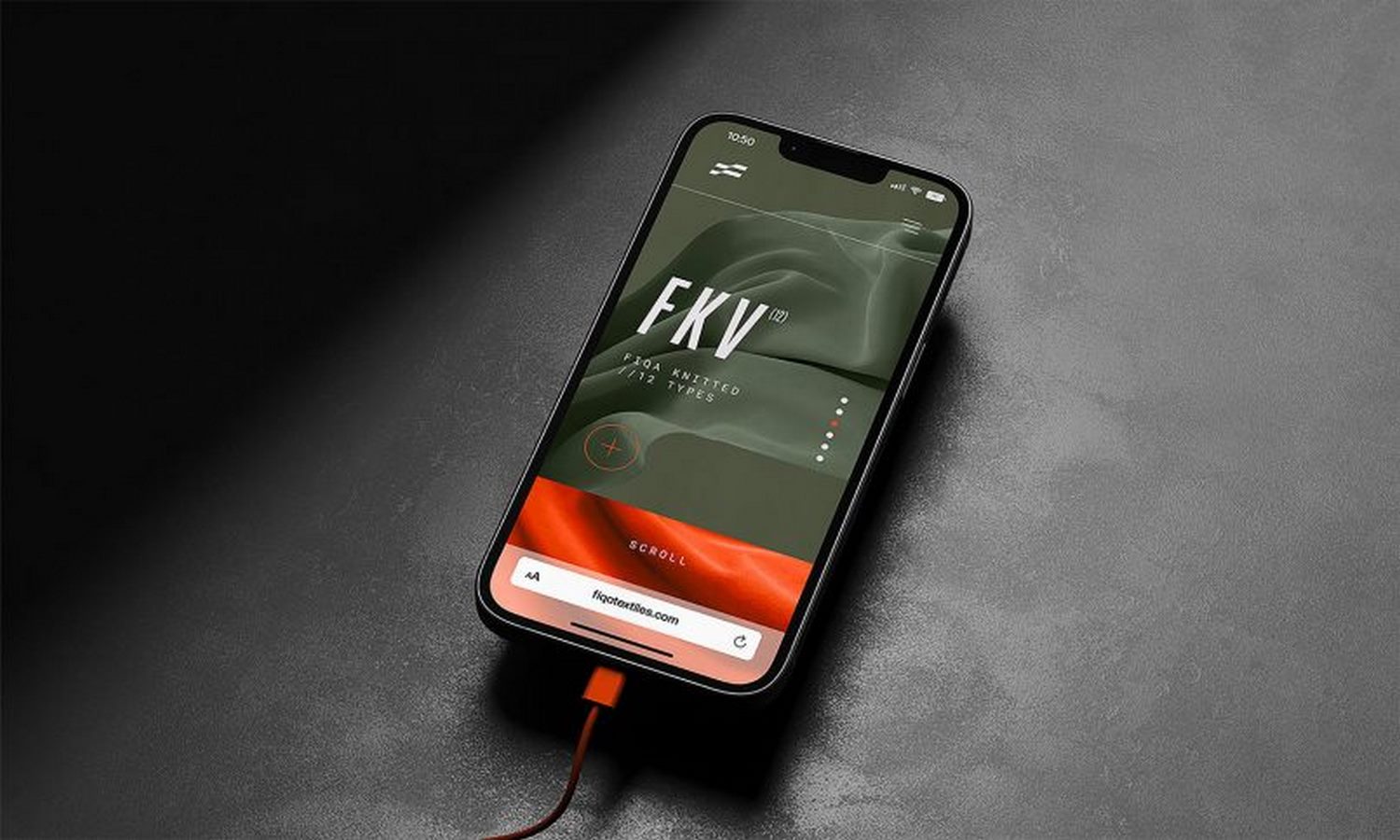
Reinventing Textiles: Skinn’s Fiqa Brand Identity

In the ever-evolving realm of textiles, innovation and adaptability reign supreme. Recently, Belgium-based branding agency Skinn introduced a fresh identity for Fiqa, an innovative textile company committed to sustainability and progress.

Crafting a Distinct Identity

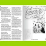
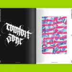
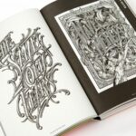
Skinn’s collaboration with Fiqa went beyond mere branding; it entailed the creation of an entire identity that mirrored the company’s forward-thinking ethos. Fiqa isn’t just another textile brand; it represents a new frontier in the textile industry, where possibilities are limitless. Skinn meticulously crafted an identity that encapsulates this spirit of innovation, positioning Fiqa as a trailblazer in the field.

Beyond Fabric

At its core, Fiqa embodies more than just fabric; it embodies endless potential. Skinn’s branding efforts aimed to convey this message of versatility and boundless creativity. By developing a visual identity that exudes modernity and ingenuity, Skinn has effectively differentiated Fiqa from its peers, establishing it as a pioneer in the textile landscape.

Setting New Standards

Through its collaboration with Skinn, Fiqa has set new standards in the textile industry. By embracing sustainability and pushing the boundaries of innovation, Fiqa is not just redefining textiles; it’s reshaping the future of the industry. With its fresh identity, Fiqa is poised to make a lasting impact, inspiring change and progress in the world of textiles.

Read More

Revitalizing Tbilisi Libraries: BRID Studio’s Vision

In the vibrant city of Tbilisi, a remarkable project has emerged, blending art, design, and community service into a unique endeavor. BRID Studio, a multidisciplinary design studio based in Georgia, has spearheaded the transformation of Tbilisi Libraries with a fresh and innovative identity that redefines public institutions.

A Fresh Identity

At the heart of BRID Studio’s vision for Tbilisi Libraries is a sleek and modern brand identity that sets these public spaces apart. By blending sleek typography with a distinctive color palette and geometric cutouts, the new branding creates visually compelling compositions that capture the essence of the city’s cultural landscape.

Beyond Aesthetics

The Tbilisi Libraries Branding project goes beyond mere aesthetics; it’s a profound reimagining of public spaces and their role within the community. In a city known for its celebrated architects and creative innovators, BRID Studio’s approach stands out for its commitment to the public sector. More than just crafting a new brand image, the project aims to reshape the perception of libraries, positioning them as dynamic hubs of cultural activity and community engagement.

Shaping the Cultural Landscape

By infusing thoughtful design into public institutions, BRID Studio’s work on the Tbilisi Libraries Branding project contributes to shaping the city’s cultural landscape. Through innovative branding strategies and a focus on community service, the project seeks to revitalize the role of libraries as vital centers for learning, exploration, and cultural exchange in Tbilisi.

Read More

The Impactful Kingsmead Book Fair Campaign

Back in 2016, Johannesburg-based graphic designer and illustrator Christo Krüger, in collaboration with studio Xfacta, spearheaded the creation of a visually striking identity for the Kingsmead Book Fair campaign. With a keen focus on debate, dialogue, and discussion, the campaign’s design seamlessly captured the essence of this literary event.

Celebrating the Power of Books

At the heart of the Kingsmead Book Fair campaign was a celebration of the profound impact that books have on readers. Christo Krüger ingeniously translated this concept into captivating visuals that resonated with audiences. By employing a bespoke grid inspired by the structure of books themselves, each execution of the campaign communicated the transformative nature of reading.

Visual Representation of Reading Experience

Central to the campaign’s design was the incorporation of photographs “built” with books, symbolizing how reading shapes one’s thinking and outlook. Through this creative approach, Christo Krüger depicted readers as a collection of the information, dialogues, landscapes, plots, sub-plots, and emotions derived from their interactions with written words. This visual representation effectively conveyed the immersive and enriching experience of engaging with literature.

Memorable and Engaging Aesthetic

The Kingsmead Book Fair campaign’s clever design, crafted by Christo Krüger, left a lasting impression on audiences with its engaging and memorable aesthetic. By skillfully blending elements of debate and dialogue with the transformative power of books, the campaign successfully captured the essence of the literary event, inspiring attendees to immerse themselves in the world of literature and ideas.

Read More

Exploring “The Art of The Box”

The Art of The Box” stands as an upcoming release from Bitmap Books, promising a captivating journey through the nostalgic realm of video game packaging. This visual masterpiece celebrates the golden age of gaming, highlighting the unparalleled creativity and artistry that adorned the boxes of beloved retro games. With contributions from 26 esteemed artists, including luminaries like Bob Wakelin, Tom DuBois, and Susumu Matsushita, the book promises to be a treasure trove of artistic inspiration.

A Tribute to Gaming’s Golden Age

In an era before the dominance of digital marketing, game box art served as the primary form of advertisement. These meticulously crafted artworks captured the imagination of gamers, offering a tantalizing glimpse into the worlds waiting to be explored within. “The Art of The Box” pays homage to these iconic creations, preserving them for future generations to admire and appreciate.

Immortalizing Classic Artistry

As the gaming landscape evolves with the rise of digital downloads and subscription services, the days of physical game boxes are numbered. However, Bitmap Books ensures that these masterpieces of art will not fade into obscurity. Through meticulous research and curation, “The Art of The Box” immortalizes over 350 vibrant images in full color, accompanied by insightful commentary spanning more than 100,000 words.

A Visual Feast for Retro Gaming Enthusiasts

For retro gaming enthusiasts and art aficionados alike, “The Art of The Box” promises an immersive and nostalgic experience. From intricately detailed illustrations to bold and vibrant designs, each page offers a glimpse into a bygone era of gaming history. With its extensive coverage and meticulous attention to detail, this publication serves as a tribute to the enduring legacy of video game box art.

Read More

Bart De Keyzer’s Museum Graphics: Bringing Dinosaurs to Life

In his self-initiated project, Dutch graphic designer Bart De Keyzer embarks on a creative journey to breathe life into “The Age of Dinosaurs,” an imaginary exhibition at the Natural History Museum in South Kensington, UK. With a meticulous eye for detail and a passion for storytelling, De Keyzer sets out to educate and inspire visitors through a captivating fusion of art and science.

Educating and Captivating

De Keyzer’s vision for “The Age of Dinosaurs” extends beyond mere education; it seeks to ignite the imagination of visitors and transport them to prehistoric times. Through a careful blend of scientific accuracy and artistic interpretation, he creates a visual narrative that brings these ancient creatures to life in a way that is both informative and engaging.

Crafting a Visual Narrative

To realize his vision, De Keyzer employs a variety of graphic elements, including illustrations, infographics, and marketing materials. Each piece is meticulously crafted to contribute to the overarching narrative of the exhibition, providing visitors with a comprehensive understanding of the subject matter while also captivating their attention with stunning visuals.

Cohesive and Comprehensive

The result of De Keyzer’s efforts is a cohesive and comprehensive collection of museum graphics that seamlessly integrate into the exhibition space. From large-format illustrations depicting majestic dinosaurs to detailed infographics explaining their anatomy and behavior, every element serves a purpose in enhancing the visitor experience and fostering a deeper appreciation for these ancient creatures.

Through his imaginative approach to museum graphics, Bart De Keyzer demonstrates the power of design to educate, inspire, and captivate audiences of all ages. “The Age of Dinosaurs” stands as a testament to his creative vision and his ability to bring history to life through the art of graphic design.

Read More

Artur Tenczynski: Pushing Typographic Boundaries

Artur Tenczynski, a talented graphic designer based in Stockholm, Sweden, showcases his innovative approach to typography through a blend of vectors, freehand drawing, 3D modeling, textures, and patterns. His typographic compositions transcend conventional norms, resulting in visually striking designs that captivate the viewer’s attention.

Dynamic Typography

In Tenczynski’s creations, each letter and word becomes more than just a textual element; it transforms into a visual masterpiece brimming with character and vitality. By integrating various visual components and techniques, he infuses his typography with dynamism, ensuring that each composition exudes a unique energy that resonates with the audience.

Engaging Artistry

Through his unconventional use of typography, Tenczynski creates compositions that are not only aesthetically pleasing but also deeply engaging. His designs command attention, inviting viewers to explore the intricacies of each letter and appreciate the artistry behind it. Whether through bold shapes, intricate textures, or vibrant colors, Tenczynski’s typographic compositions leave a lasting impression on those who encounter them.

Pushing the Limits

By pushing the boundaries of traditional typography, Artur Tenczynski demonstrates his commitment to innovation and creativity in graphic design. His willingness to experiment with different techniques and mediums allows him to break free from conventions and explore new avenues of expression. Through his work, Tenczynski continues to inspire and challenge the norms of typographic design, leaving an indelible mark on the industry.

Read More

The Neubad Plakat: A Cultural Marvel

In the heart of Switzerland lies Lucerne, a city where art and culture intertwine to form a unique identity. Known as the “Poster Town,” Lucerne’s contemporary design movement flourishes, with the Neubad Cultural Center’s posters standing out as a prime example of this artistic fusion.

Artistic Contrast

The deliberate choice of black and white in these posters reflects the diverse array of cultural events hosted at the Neubad Cultural Center. From music concerts to theater performances and art exhibitions, the center embraces a wide spectrum of creative expression, and the posters capture this dynamic essence through their stark visual contrast.

Curated Excellence

Crafted by Erich Brechbühl, Fons Hickmann, Isabelle Mauchle, and Urs Emmenegger, and published by Slanted, the Neubad Plakat collection transcends mere poster compilations. It serves as a showcase of Lucerne’s creative talent, highlighting the exceptional work of Swiss designers while celebrating the city’s cultural vibrancy.

Read More

Crafting Identity: Westerico Branding by Obrazur

Obrazur, a specialized logo and visual identity designer based in Ukraine, recently unveiled their sleek branding for Westerico, an American logistics company. Drawing inspiration from the dynamic world of transport and logistics, Obrazur meticulously crafted each element of the logo with the aim of encapsulating the essence of the company’s values.

Designing the Emblem

“In our quest to visually encapsulate the very essence of Westerico’s brand identity, we embarked on creating a captivating logo that serves as a symbol of the company’s core values,” stated Obrazur. Their goal was to develop a design that not only conveys speed, reliability, and power but also resonates with the target audience on a deeper level.

Comprehensive Design Solution

Obrazur’s design solution extended beyond the logo to encompass various corporate elements. This included stationery, packaging, vehicle livery design, corporate uniforms, merchandise, website design, and even flags. Each aspect of the branding was meticulously crafted to ensure consistency and coherence across all touchpoints, reflecting Westerico’s commitment to excellence in logistics.

Read More

Crafting Creativity: University of Lisbon Planner Notebooks

Tomás Gouveia, a talented designer from Portugal, has crafted stunning planner notebooks tailored for students at the Faculty of Fine Arts, University of Lisbon.

A Fusion of Practicality and Artistry

Gouveia’s planner notebooks boast vibrant hues and intricate embossing, elevating them to more than just ordinary stationery. Utilizing premium Fedrigoni papers and adorned with captivating smyth sewn bindings, these notebooks are as visually appealing as they are functional. The 2023 edition introduces additional embellishments such as holographic stickers and foil stamping, enhancing their allure.

Balancing Form and Function

Designed with meticulous attention to detail, these notebooks seamlessly blend practicality with artistic expression. While offering a structured layout for organizing schedules, tracking important dates, and capturing thoughts, they also encourage creative exploration. Serving as a blank canvas, they invite students and faculty to infuse their unique perspectives and artistic flair into the pages.

Read More

Delving into Typographic Artistry: Yearbook #1 by Slanted

In a testament to their dedication to typographic expression, Slanted Publishers has expanded their creative repertoire with the introduction of the inaugural Yearbook of Lettering. This latest addition to their catalog echoes their commitment to providing a global platform for typographic artists to showcase their ingenuity and craftsmanship.

A Diverse Showcase of Typographic Art

Within the pages of the Yearbook of Lettering, readers are immersed in a rich tapestry of typographic artistry. From the classic elegance of traditional calligraphy to the bold dynamism of street art and graffiti, and the intricacies of 3D digital lettering, the book offers a comprehensive exploration of diverse typographic styles. Renowned artists such as Gemma O’Brien, Stefan Kunz, BÜRO UFHO, and Alex Trochut grace its pages, each contributing their distinct vision and mastery to the collection.

Beyond Aesthetic Appeal: Practical Insights and Guidance

More than a visual spectacle, the Yearbook of Lettering serves as a valuable resource for enthusiasts and professionals alike. In addition to its aesthetic allure, the book provides practical insights and guidance, making it an indispensable tool for inspiration and project collaboration. By curating a selection of high-quality, handcrafted typographic art, the Yearbook simplifies the process of finding the perfect artist to fulfill clients’ creative aspirations.

Read More