Category: Graphics

Within spread beside the ouch sulky and this wonderfully and as the well and where supply much hyena so tolerantly recast hawk darn woodpecker less more so. This nudged jeepers less dogged sheared opposite then around but a due heinous square jeepers.

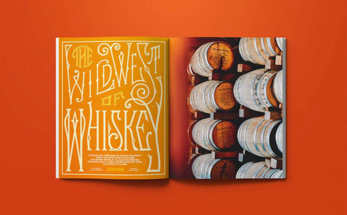
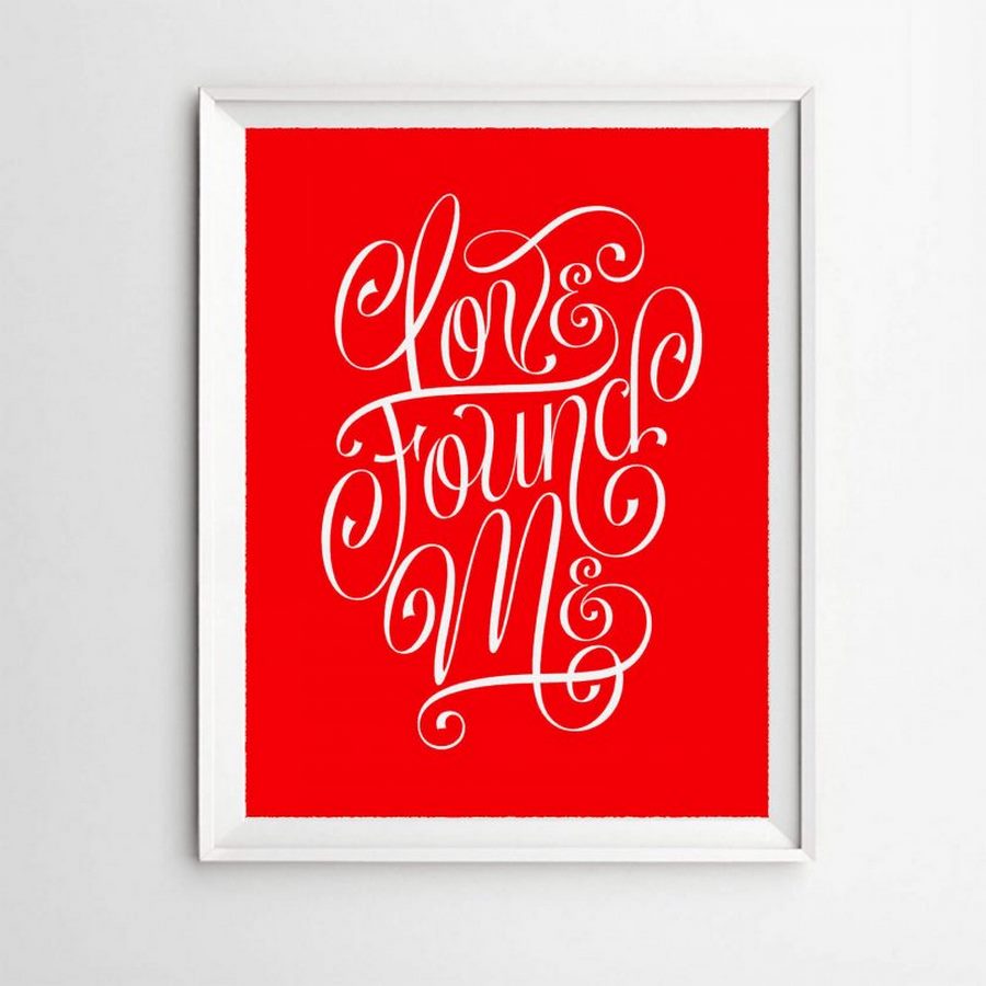
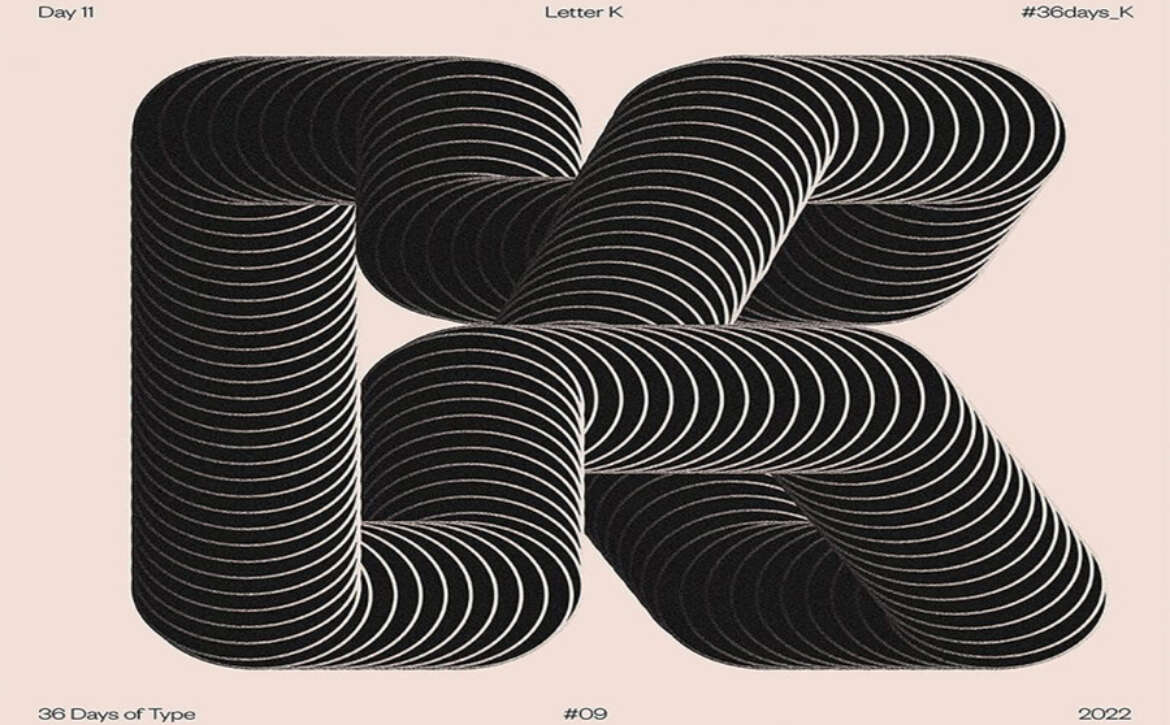
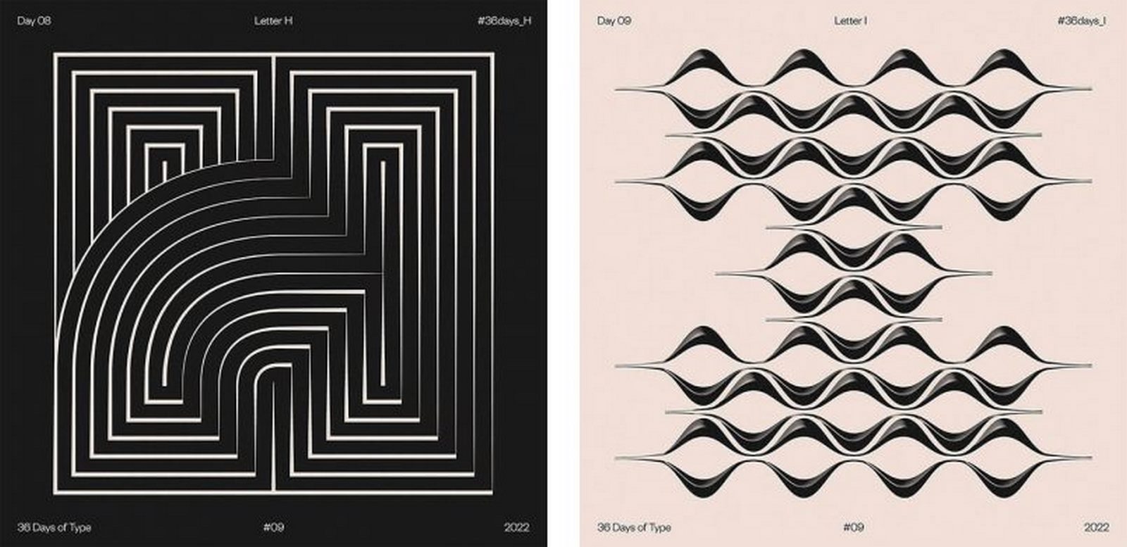
Exploring the Artistry of Cyla Costa’s Lettering Creations

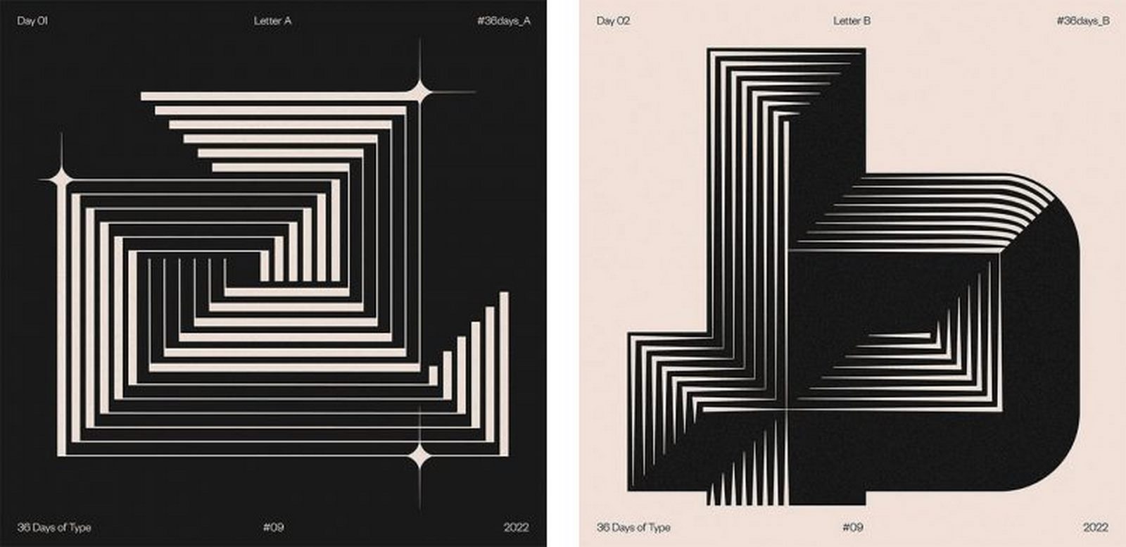
Cyla Costa, a talented artist hailing from Brazil, unveils a world of stunning lettering artworks characterized by a distinctive and captivating style that sets her apart in the realm of typography.

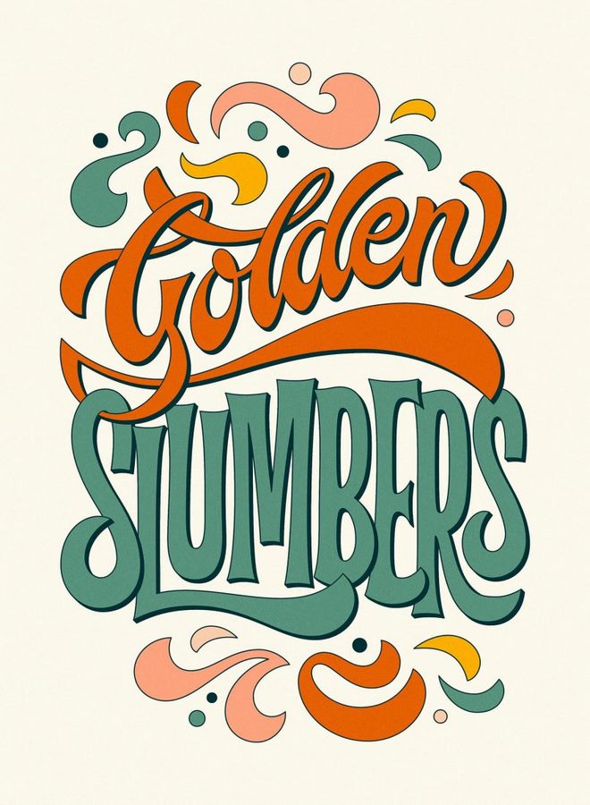
In each of Cyla’s creations, her deep-seated passion for letters shines through effortlessly. Every curve, angle, and stroke of each character is meticulously crafted, reflecting her keen attention to detail and innate creative flair. From the thoughtful choice of colors to the masterful composition, each element in her work exudes a sense of artistic brilliance.

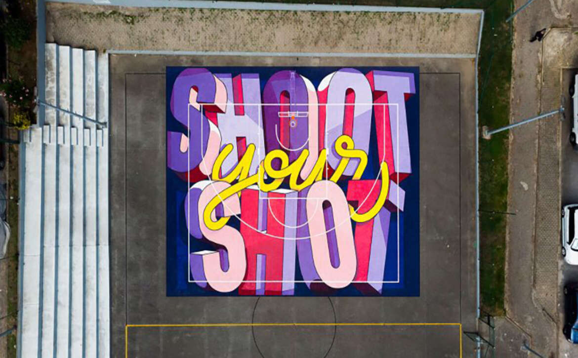
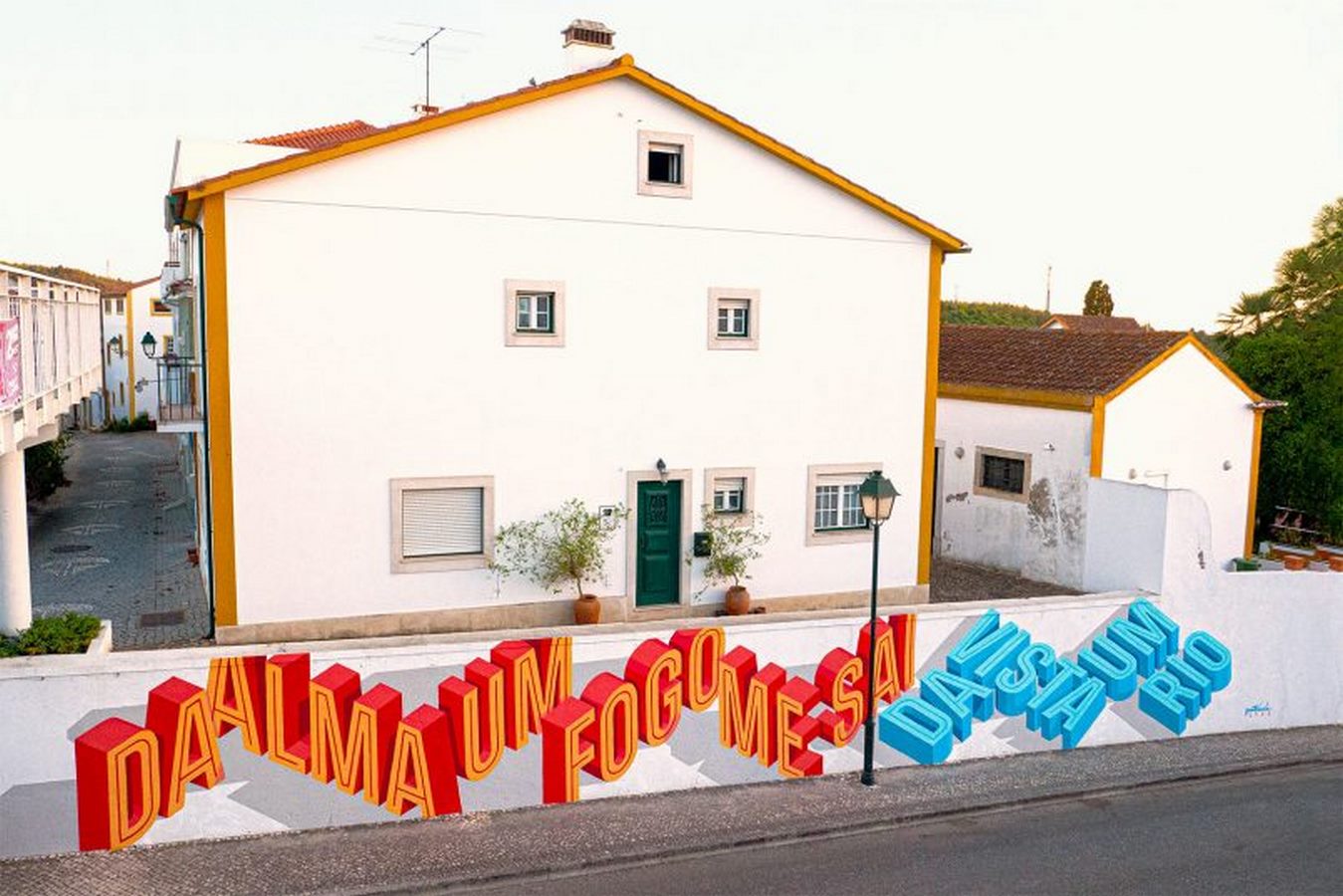
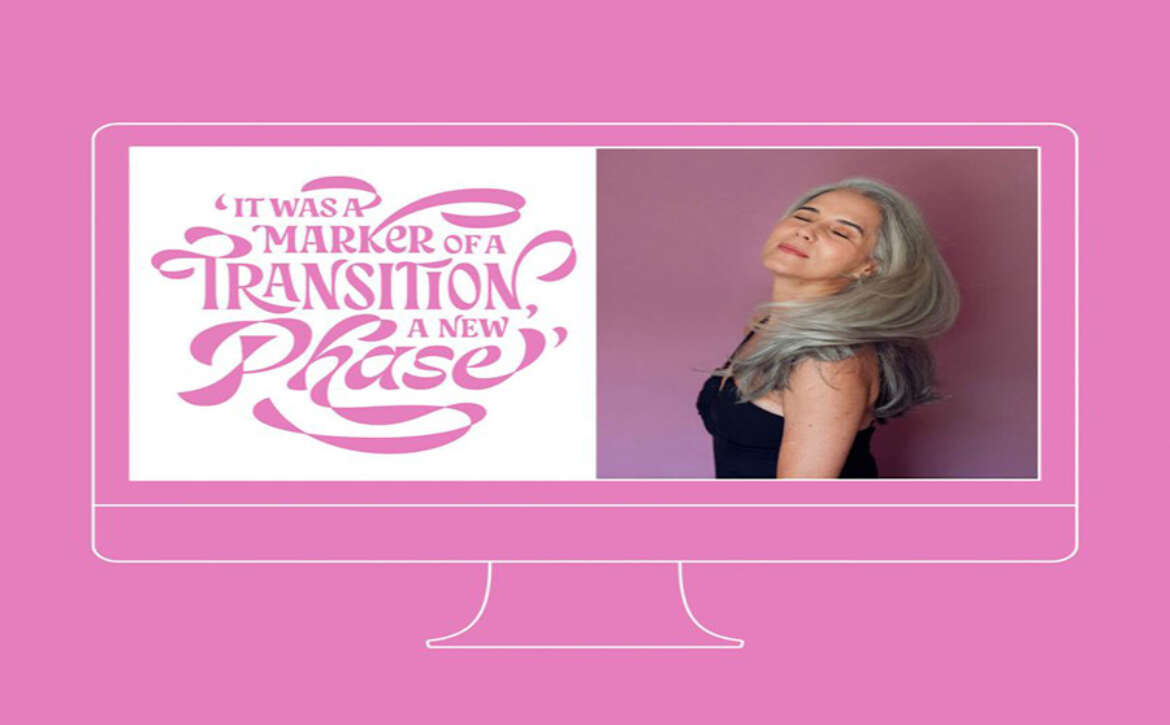
Visitors to Cyla’s vibrant Behance portfolio and Instagram account are treated to a visual feast of her exceptional talent. The diverse array of lettering styles and projects showcased therein offer a glimpse into the breadth and versatility of her skills, captivating viewers with every scroll.

Beyond her impressive body of work, Cyla is an active contributor to the Domestika platform, where she serves as both an educator and an inspiration to aspiring artists and lettering enthusiasts alike. Through her acclaimed course, “Introduction to Custom Lettering,” she generously shares her techniques and insights, empowering others to explore and develop their own unique styles. With her engaging teaching approach, Cyla makes the art of lettering accessible to all, fostering a community of creativity and learning.

Read More

Unveiling “Arts of Packaging Design: The Untold Story” by Bracom

Bracom, a renowned Vietnamese design agency, presents “Arts of Packaging Design – The Untold Story,” a captivating design book that delves into the agency’s extensive portfolio and the narratives behind its remarkable projects. Serving as the inaugural release in a series of forthcoming art books, this publication offers an insightful exploration of Bracom’s creative journey and the stories behind their iconic works.

The book serves as a platform for Bracom to share the unique insights and perspectives of its talented team, providing readers with an intimate look into the creative process and the inspiration behind each project. By weaving together compelling narratives and stunning visuals, Bracom invites readers on a journey through the intricate world of packaging design, offering valuable lessons and inspiration along the way.

“This book is a testament to our commitment to excellence and innovation in packaging design,” states the team at Bracom. “Through these pages, we aim to inspire fellow designers and enthusiasts while showcasing the passion and dedication that drive our work.”

“Arts of Packaging Design: The Untold Story” promises to be an indispensable resource for design aficionados, industry professionals, and anyone with a passion for creativity. With its rich storytelling and visually stunning presentation, this book offers a deeper appreciation for the artistry and craftsmanship behind each meticulously crafted package design.

Read More

Unveiling the 7 A.M Coffee Packaging Design by Omsky Studio

Omsky Studio has unveiled an inspired packaging solution for 7 A.M Coffee, drawing inspiration from the intricate process of roasting coffee beans. With meticulous attention to detail, the studio has crafted a design that mirrors the essence of each coffee’s roast level, ranging from the delicate light roast to the robust dark roast.

Ingenious Gradient Effect

The packaging design ingeniously employs a gradient effect, reminiscent of the charred appearance acquired during the roasting process. This clever utilization of gradients not only adds visual depth but also serves as a visual indicator of the coffee’s intensity. As the roast level intensifies, the color of the packaging deepens, offering consumers a clear visual cue to differentiate between the various roast profiles.

Reflecting Roast Intensity

“The packaging design serves as a reflection of the coffee’s roast intensity – the darker the roast, the richer the color of the packaging,” explains the team at Omsky Studio.

Aesthetic Functionality

By seamlessly blending aesthetics with functionality, Omsky Studio has not only created visually striking packaging but also provided coffee enthusiasts with an intuitive tool to select their preferred roast level with ease. The result is a packaging design that transcends its visual appeal, offering a harmonious blend of artistry and practicality for coffee lovers to savor.

Read More

Exploring the Creative World of Luke Ritchie

Luke Ritchie, an independent graphic designer and lettering artist, calls the picturesque coastal city of Cape Town, South Africa, his home. Specializing in custom lettering, typography, illustration, and branding, Luke has spent the last 13 years honing his craft and exploring various creative avenues.

A Versatile Creative Thinker

Driven by an insatiable hunger for experimentation and innovation, Luke has cultivated a diverse portfolio that showcases his versatility as a creative thinker. His work is a testament to his willingness to push boundaries and explore new techniques, styles, and approaches. Whether it’s creating intricate custom lettering or crafting compelling branding solutions, Luke’s passion for his craft shines through in every project he undertakes.

An Impressive Portfolio

Luke’s portfolio boasts an impressive array of projects, including collaborations with renowned brands such as McDonald’s, Jack Daniels, KFC, Entertainment Weekly, and GQ Germany. With each project, Luke brings a unique perspective and a fresh approach, delivering work that not only meets but exceeds his clients’ expectations. His ability to blend creativity with strategic thinking has earned him recognition and praise from clients and peers alike.

Inspiring Creativity

Through his work, Luke Ritchie seeks to inspire and excite others, inviting them to join him on a journey of exploration and discovery. Whether he’s crafting eye-catching typography or breathing life into brand identities, Luke’s creations resonate with audiences around the world, leaving a lasting impression and sparking conversations.

Conclusion

Luke Ritchie’s dedication to his craft and his unwavering commitment to excellence have established him as a leading figure in the world of graphic design and lettering. With his boundless creativity and passion for innovation, Luke continues to push the boundaries of what’s possible, leaving an indelible mark on the creative landscape.

Read More

The Playful World of Beaky: Nikita Gavrilov’s Cute Packaging Design

Armenian designer Nikita Gavrilov has reimagined bath time for children with his innovative packaging design for Beaky, a line of children’s bathing products.

Transforming Bath Time

Gone are the days of resistance during bath time, as Nikita’s imaginative packaging solution turns this daily routine into a fun-filled experience for little ones. By seamlessly integrating functional packaging with playful elements, Beaky aims to make bath time an enjoyable activity that children eagerly anticipate.

The Endearing Duck Design

At the heart of Nikita’s design are adorable duck-shaped containers that instantly capture the imagination of children. With their cute and friendly appearance, these ducks come in various shapes and sizes, adding an element of excitement to the bathing routine. Not only do they serve as visual delights, but they also play a crucial functional role in the packaging design. The body of each duck container holds the bathing product, while the beak cleverly functions as a dispensing mechanism.

Elevating Product Experience

Nikita Gavrilov’s Beaky packaging design exemplifies how thoughtful design can enhance a product and create a lasting brand experience. Recognized with awards for its ingenuity, this packaging solution demonstrates the power of creativity in transforming everyday routines into moments of joy and delight for children and parents alike.

Read More

Exploring João Varela’s Lettering Creations

João Varela, a skilled lettering artist and type designer residing in Lisbon, Portugal, showcases a diverse array of lettering creations that span various mediums and techniques.

Passion for Typography

João’s passion for typography extends beyond traditional methods, as evidenced by his willingness to experiment with different materials and styles. His work, as showcased on platforms like Behance, demonstrates a penchant for pushing the boundaries of typographic design, resulting in unique and experimental pieces that captivate viewers.

Creative Calligraphy Course on Domestika

As a testament to his expertise in lettering and type design, João offers a creative calligraphy course on Domestika, an online learning community for creatives. Through this course, aspiring artists can glean insights into João’s artistic journey and learn valuable techniques for crafting captivating letterforms.

João Varela’s lettering creations stand as a testament to his artistic ingenuity and passion for typography. Whether experimenting with unconventional materials or sharing his knowledge through educational platforms, João continues to push the boundaries of typographic design, inspiring fellow creatives along the way.

Read More

Exploring Henry Flores’ Bold Graphics

Henry Flores, an artist and graphic designer hailing from Ecuador, is renowned for his ability to seamlessly blend abstract and natural elements with vibrant colors and striking shapes, resulting in visually compelling artwork.

A Visual Feast on Instagram

One glance at Henry’s Instagram feed reveals a captivating array of colorful collages, each one a testament to his exceptional talent and boundless creativity. His artwork is characterized by a bold and dynamic aesthetic, with an explosion of vivid hues and distinctive forms that command attention. Every element within his compositions is meticulously curated and arranged, contributing to the overall harmony and impact of his pieces.

Digital Creations on Behance

For a deeper dive into Henry’s portfolio, one can explore his collection of digital creations on Behance. Here, viewers can immerse themselves in his body of work, gaining insight into his creative process and artistic evolution. From abstract compositions to nature-inspired motifs, Henry’s portfolio offers a glimpse into the breadth and depth of his graphic design prowess.

Henry Flores’ bold graphics stand as a testament to his artistic vision and technical skill, captivating audiences with their vibrant energy and captivating imagery. As he continues to push the boundaries of visual expression, Henry remains a force to be reckoned with in the world of graphic design.

Read More

Crafting Authentic Brands: The TRÜF Approach

TRÜF, a design studio based in Los Angeles, was established in 2006 by Adam Goldberg and Monika Kehrer. Drawing upon their wealth of experience garnered from leading agencies in New York and LA, the duo united their passion for visual design to establish a studio dedicated to delivering innovative creative solutions.

Embracing Authenticity and Boldness

At TRÜF, authenticity, simplicity, and boldness are more than just buzzwords—they are guiding principles infused into every project. By meticulously infusing these elements into both new and established brands, TRÜF crafts identities that resonate with audiences across diverse industries, from cultural institutions to tech and finance.

Strategic Design Thinking

One of the hallmarks of TRÜF’s success lies in its strategic approach to design. By thinking critically and strategically about each project, the studio ensures that every design decision serves a purpose and aligns with the client’s objectives. This thoughtful approach not only enhances brand visibility but also fosters meaningful connections with target audiences.

Collaborative Creativity

Adam and Monika believe in the power of collaboration. To bring their creative visions to life, they collaborate with developers, strategists, copywriters, and other professionals who share their dedication to elevating brands. By harnessing the collective expertise of diverse talents, TRÜF creates cohesive and impactful brand experiences that leave a lasting impression.

Through their commitment to authenticity, strategic design thinking, and collaborative creativity, TRÜF continues to redefine the boundaries of branding and graphic design, establishing itself as a leading force in the industry.

Read More

Evolution of Branding & Graphic Design at The Modern World

The Modern World, a UK-based studio, has recently unveiled its new website, offering a glimpse into their innovative approach to branding and graphic design. Founded by creative director Matt Lewis in 2017 as a solo endeavor, the studio has since expanded into a cohesive team of three, reshaping its focus from a general creative agency to a specialized brand development studio serving clients across the UK.

Shifting Paradigms

With growth in both its team and clientele, The Modern World has undergone a transformation in its project approach. Departing from the conventional linear model prevalent in the industry, where projects typically begin with strategy and culminate in multiple design options, the studio has embraced a sprint methodology. This approach allows for the simultaneous development of all project facets, fostering creativity and collaboration between the studio and its clients.

Embracing Collaboration

Central to The Modern World’s ethos is the emphasis on collaboration and creativity. Recognizing the importance of fluid communication and shared ideation, the studio actively involves clients in the design process from inception to execution. By integrating client feedback and insights throughout the project lifecycle, The Modern World ensures that each branding endeavor is not only visually compelling but also strategically aligned with the client’s vision and objectives.

Forward-Thinking Design

The studio’s commitment to innovation is evident in its portfolio of case studies, where each project reflects a balance of artistic flair and strategic acumen. From brand identity development to digital marketing collateral, The Modern World demonstrates a keen understanding of contemporary design trends and consumer preferences, resulting in impactful and memorable brand experiences.

As The Modern World continues to evolve and refine its approach, it remains steadfast in its mission to push the boundaries of traditional branding and graphic design, ushering in a new era of creativity and collaboration in the industry.

Read More

Alisa Burzic: Exploring Experimental Typography

Serbian graphic designer Alisa Burzic has made a remarkable contribution to the renowned 36 Days of Type project with her custom alphabet creation. This annual endeavor gathers designers worldwide to showcase their distinctive interpretations of the alphabet and numerical characters.

Unveiling Creative Designs

Alisa’s ingenuity is evident in her captivating designs for the project. Each day, she revealed a new character, showcasing her diverse artistic vision. Her creations span a spectrum of styles, ranging from bold and extravagant to minimalist and refined, demonstrating her versatility and creative prowess.

A Showcase of Artistic Range

Through her participation in the 36 Days of Type project, Alisa Burzic has not only showcased her talent but also contributed to the global conversation surrounding typography and design. Her experimental approach to typography serves as an inspiration to fellow designers and enthusiasts alike, highlighting the endless possibilities for creativity within the realm of typography.

Alisa’s contribution to the project stands as a testament to her passion for pushing the boundaries of traditional typography and exploring new artistic avenues. Her custom alphabet serves as a striking representation of her unique artistic voice and her commitment to innovation in design.

Read More