Category: Interiors

Innovating Nature The New Nature Store by Salon Alper Derinbogaz

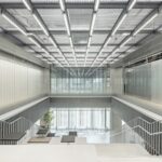
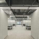
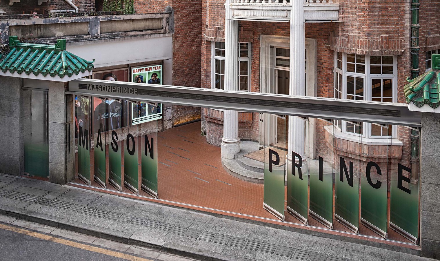
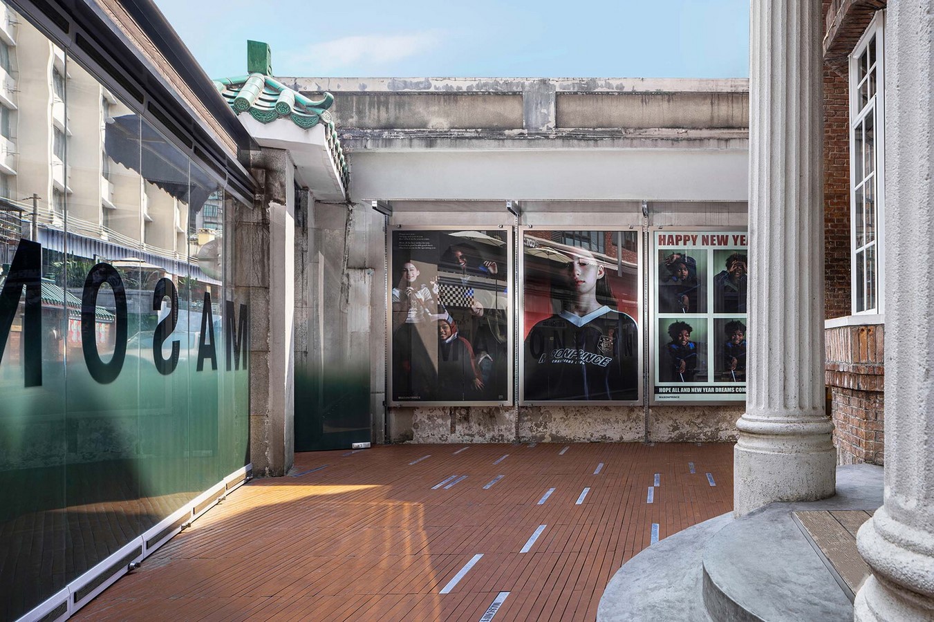
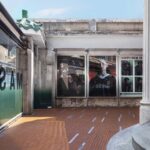
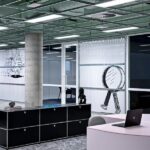
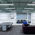
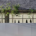
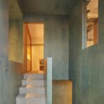
Salon Alper Derinboğaz, in collaboration with Reflect Studio, introduces a revolutionary concept in store design, redefining our perception of nature and sustainability. The New Nature Store in Istanbul represents a visionary approach to our evolving relationship with the environment, blending innovative materials and experimental techniques to create a new living habitat.

Embracing Futurism and Sustainability

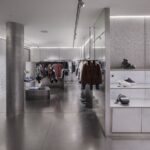
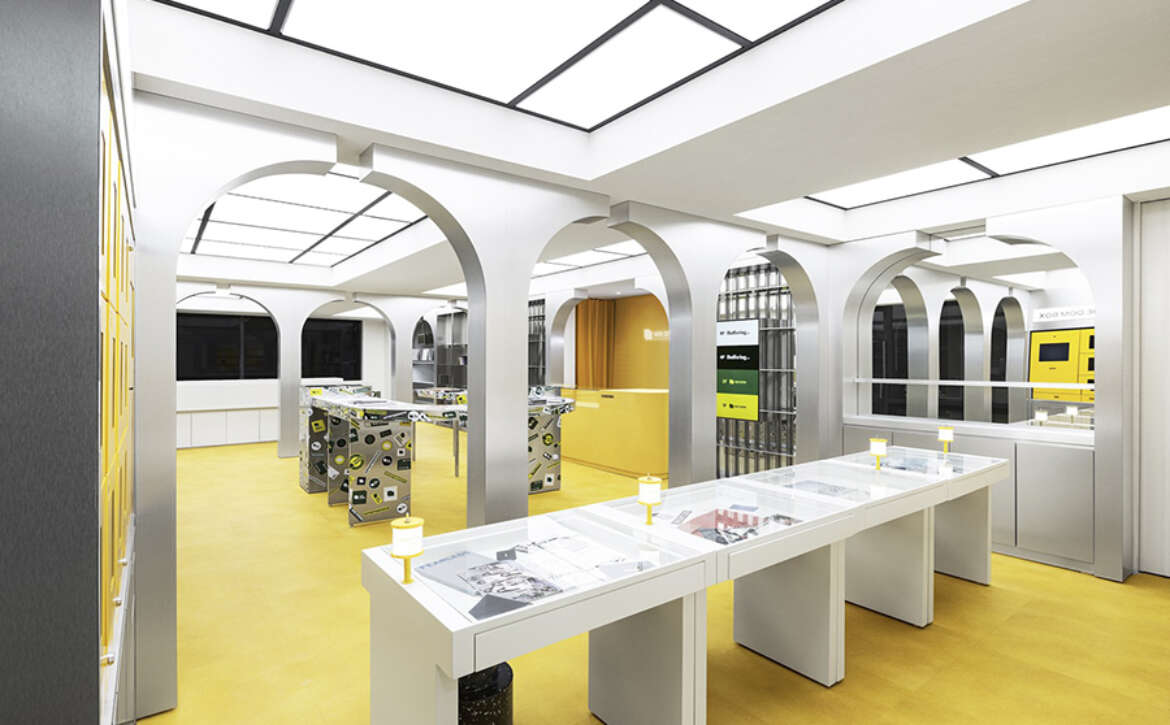
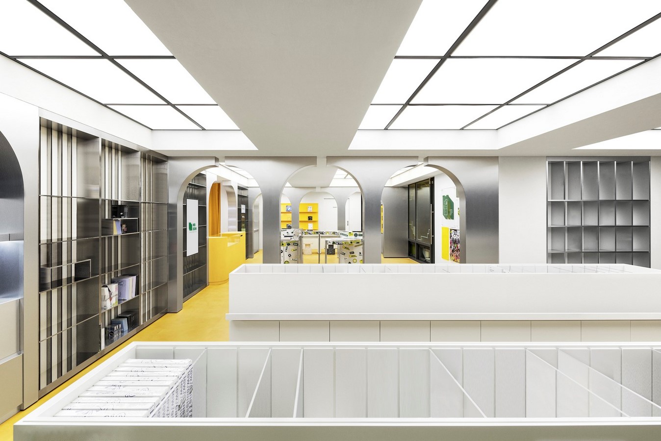
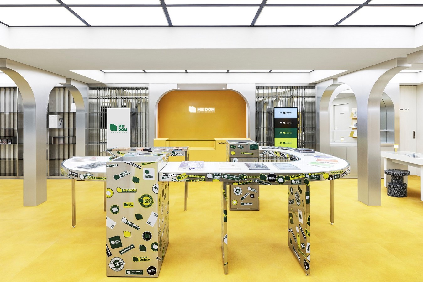
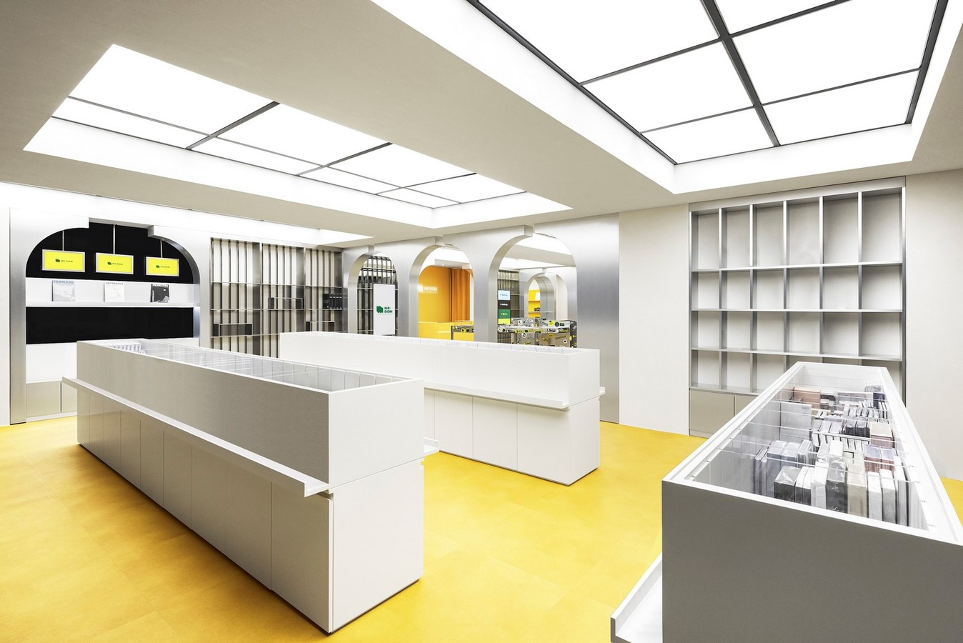
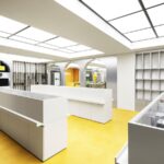
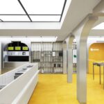
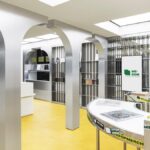
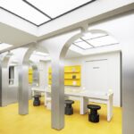
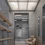
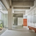
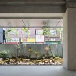
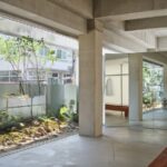
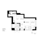
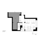
The New Nature Store transcends traditional retail spaces, embracing concepts of optimistic futurism and sustainability. Designed as a space for exploration and experimentation, it challenges conventional notions of shopping experiences by incorporating elements of upcycling, recycling, and repair culture. Through fluid design approaches, the store seeks to realize a future where sustainability is intertwined with everyday practices.

Experimental Design Elements

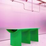
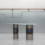
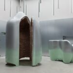
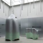
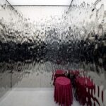
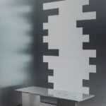
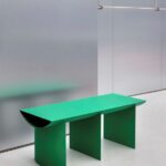
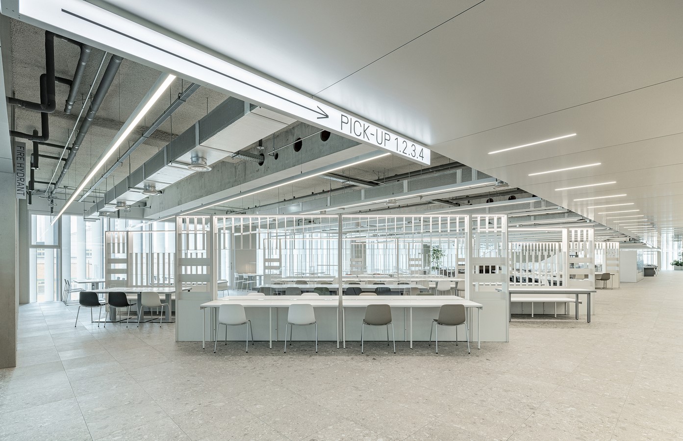
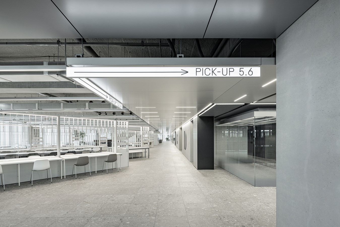
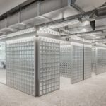
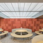
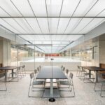
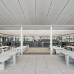
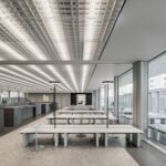
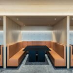
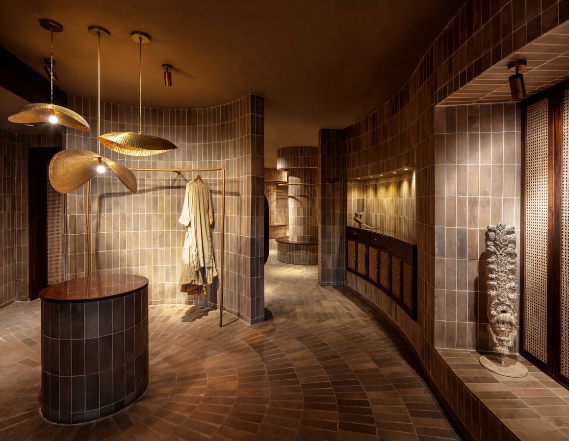
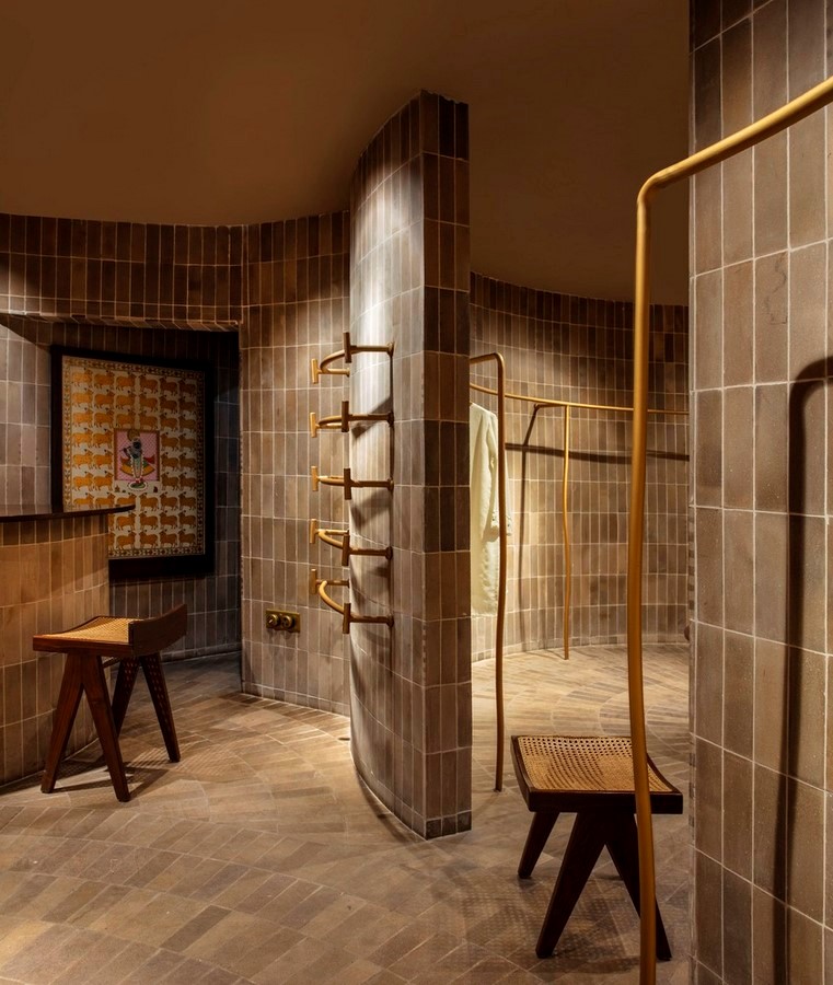
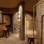
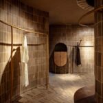
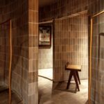
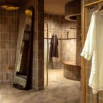
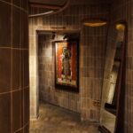
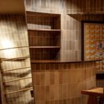
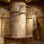
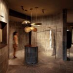
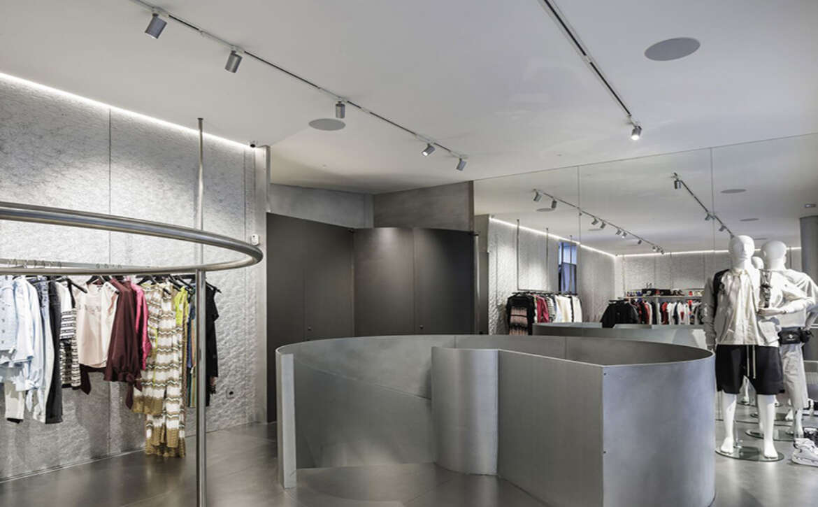
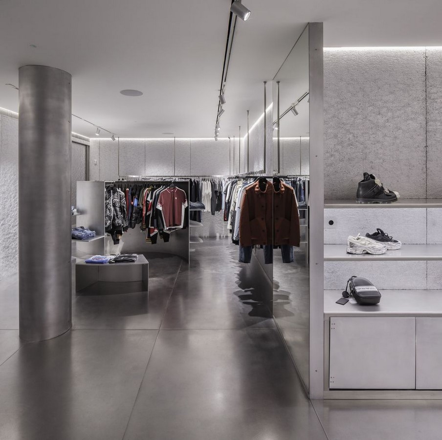
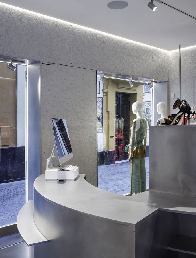
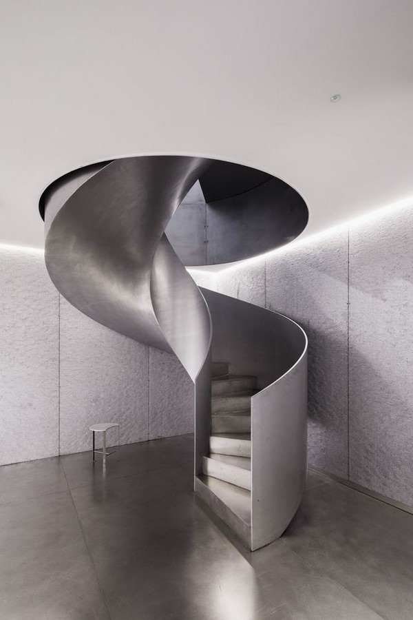
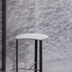
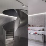
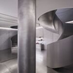
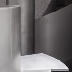
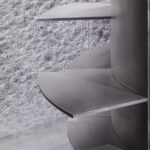
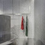
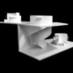
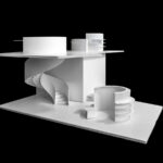
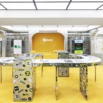
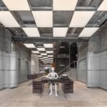
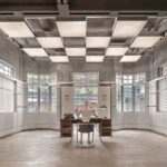
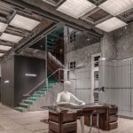
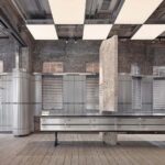
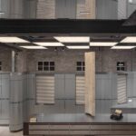
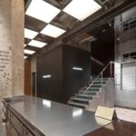
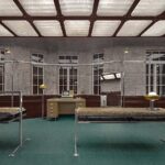
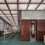
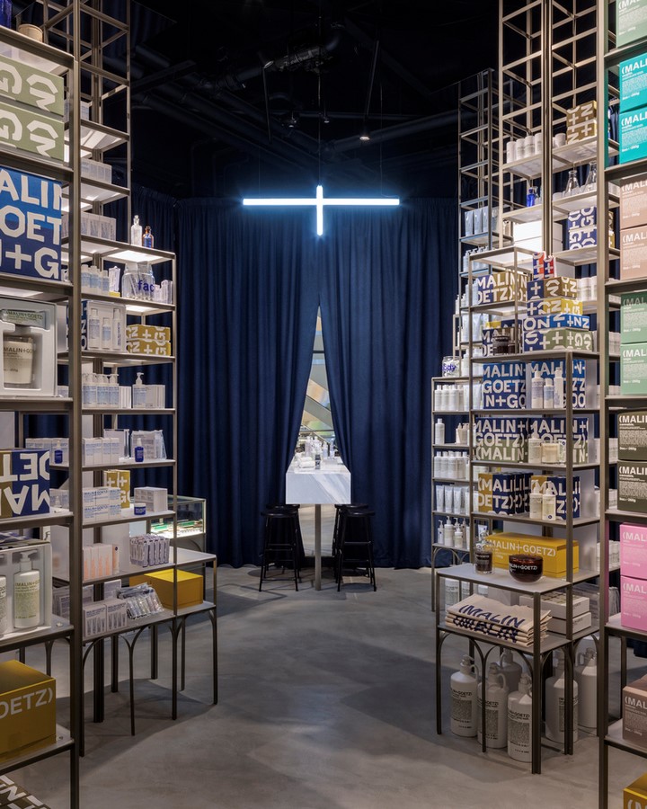
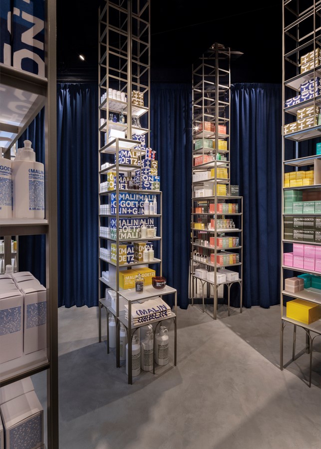
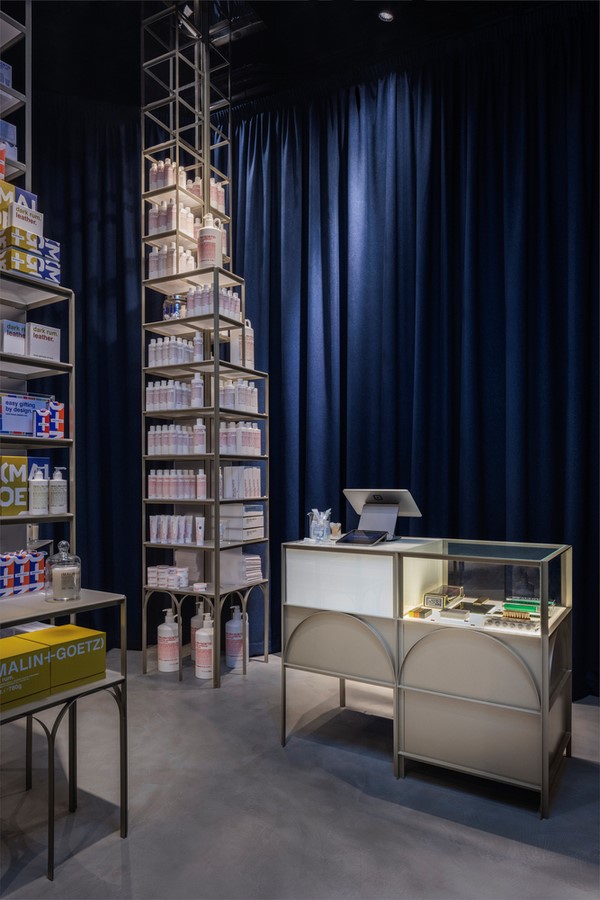
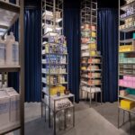
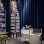
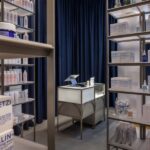
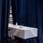
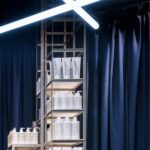
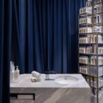
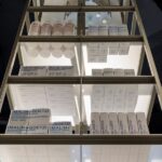
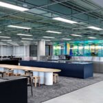
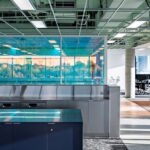
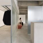
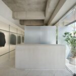
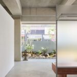
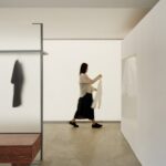
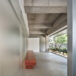
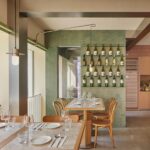
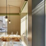
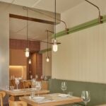
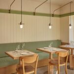
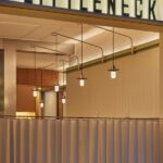
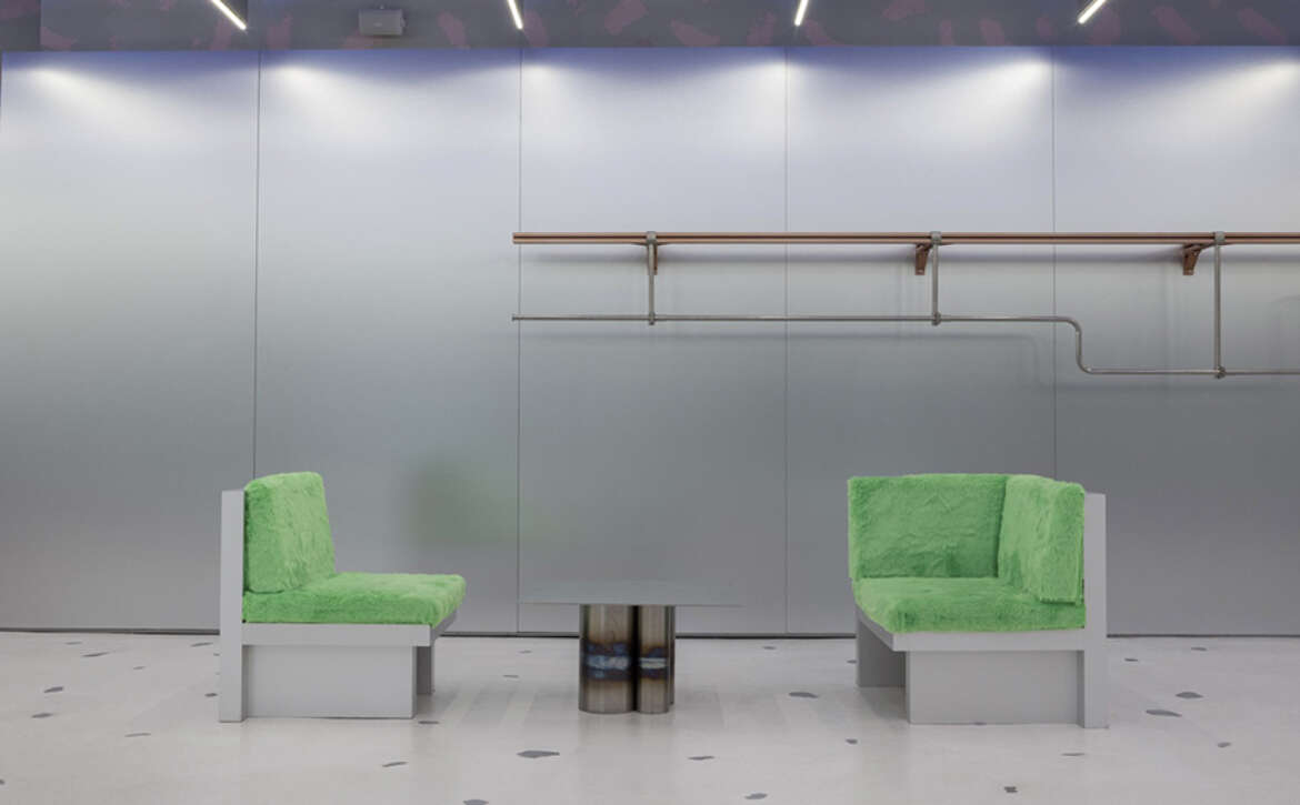
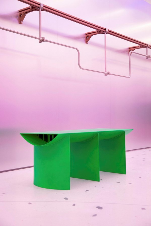
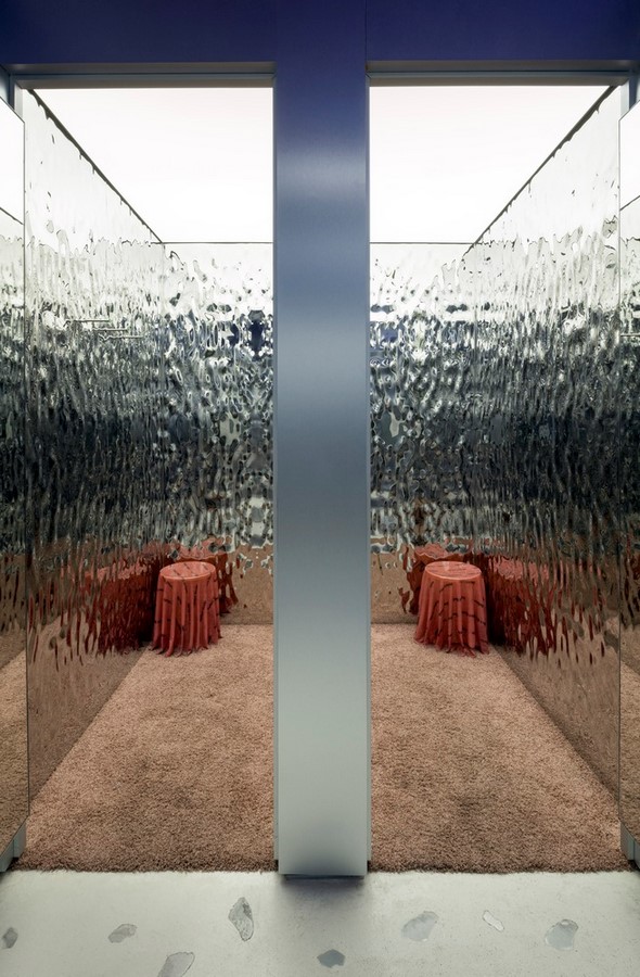
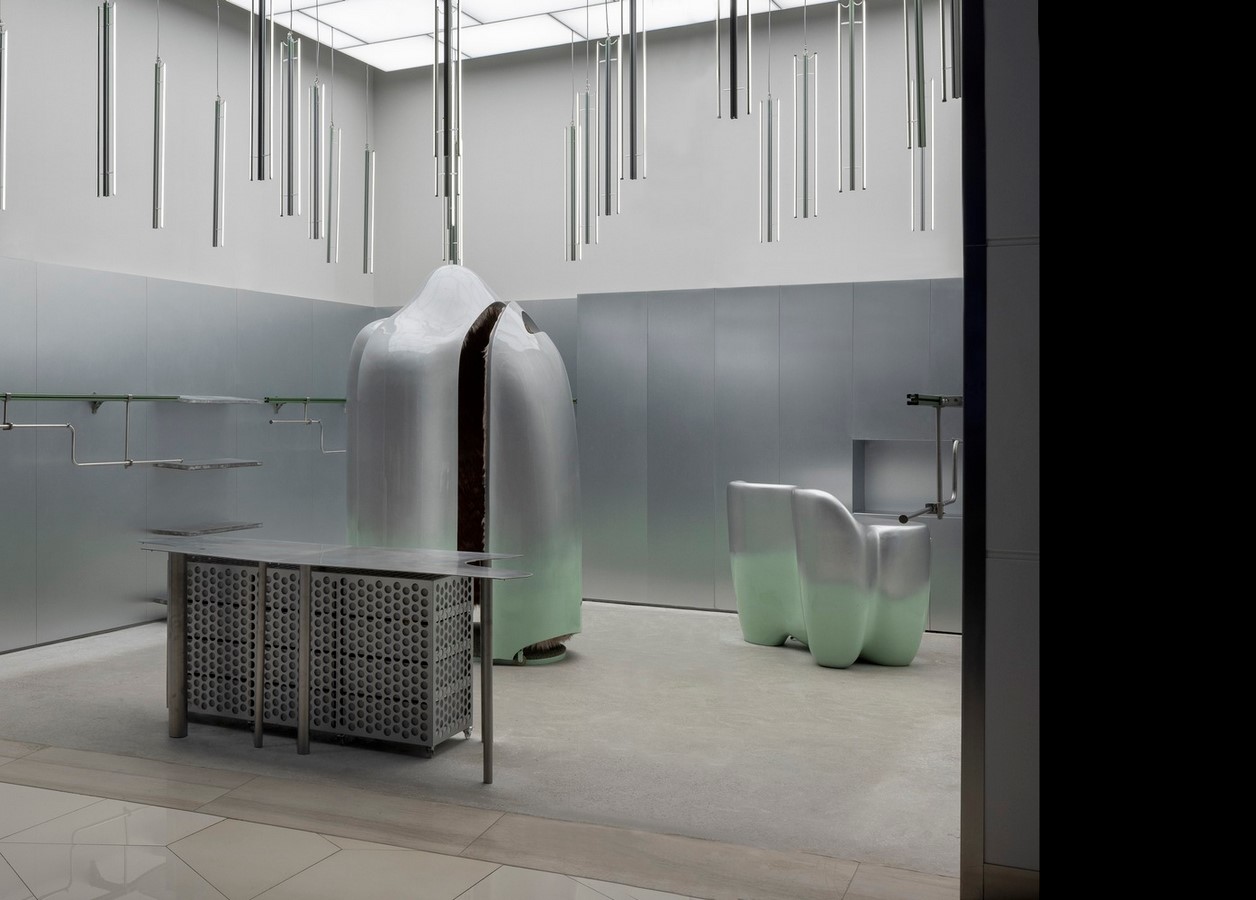
At the heart of the New Nature Store are its experimental design elements, carefully curated to reflect an optimistic vision of the future. Recycled metal terrazzo flooring, frozen textile stools, water ripple changing units, sigma profile hangers, green airplane-wing benches, and AI-generated furniture are just some of the innovative features that define the physical space. These elements highlight the potential of repurposed materials and advanced production techniques in shaping sustainable environments.

Transformative Production Processes

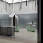
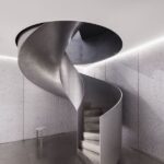
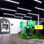
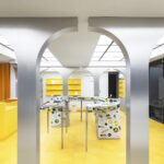
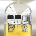
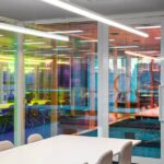
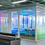
The project embraces a generative design process inspired by nature’s evolutionary principles. Utilizing production waste from various industries, such as aluminum parts and leftover fabrics, the team created durable and visually striking elements. By harnessing boat-building technology and AI-driven design, they transformed digital concepts into tangible objects with precision and efficiency.

Futuristic Experiences

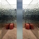
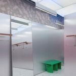
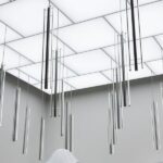
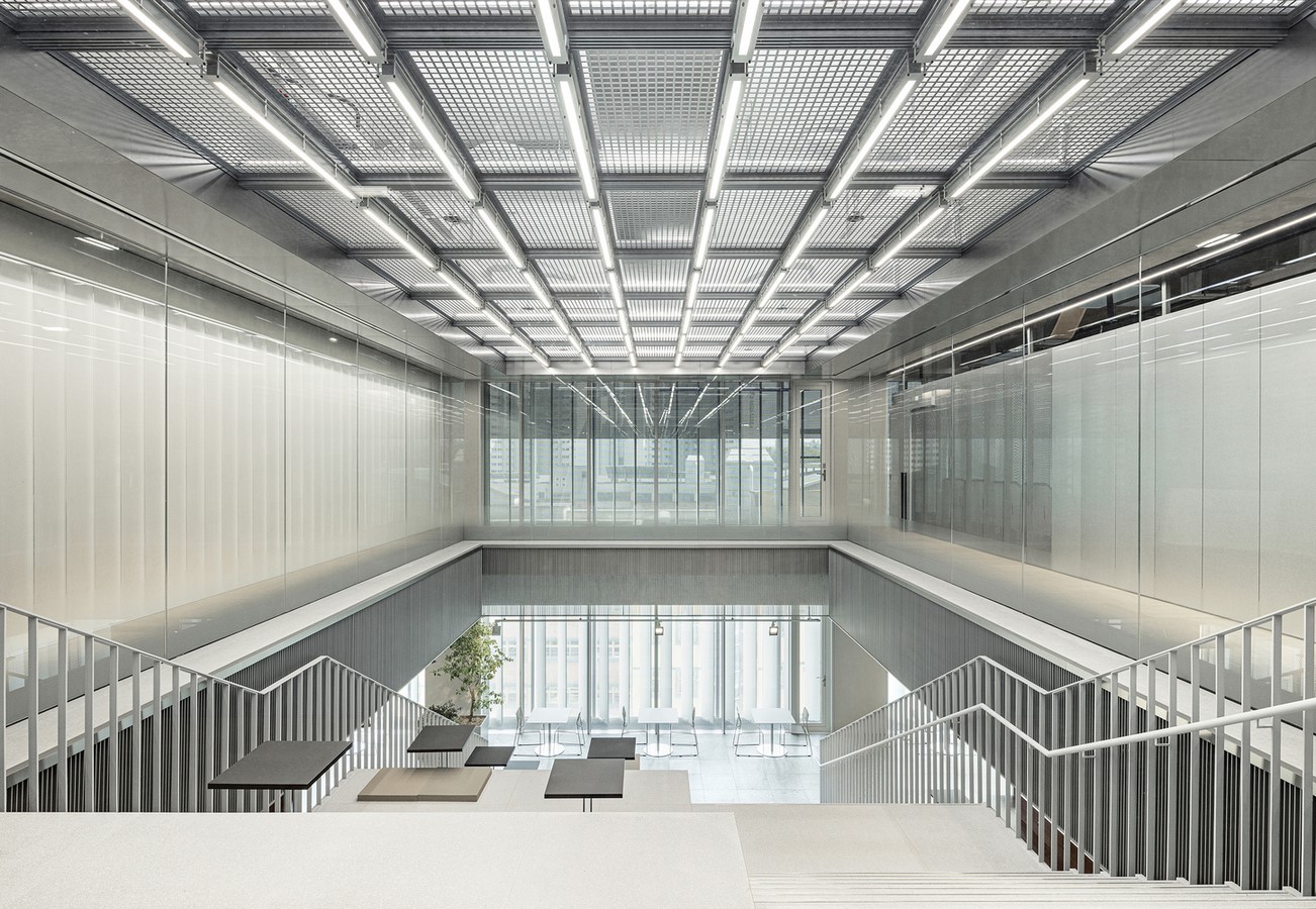
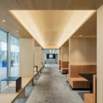
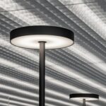
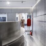
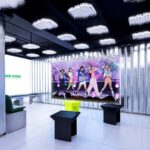
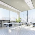
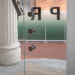
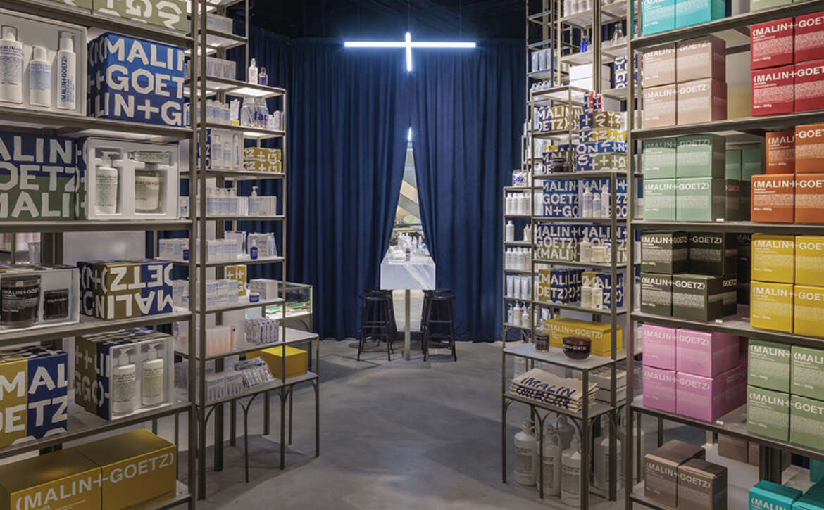
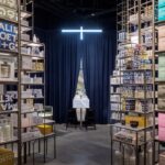
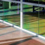
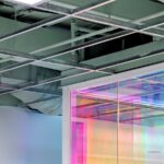
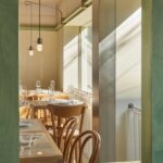
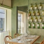
The New Nature Store offers visitors a glimpse into the future of retail experiences. From the water ripple changing rooms to the futuristic Changing Pod, every aspect of the store is designed to captivate and inspire. Fiberglass construction, programmable lighting fixtures, and personalized product services elevate the customer experience, creating an immersive environment that blurs the lines between physical and digital realms.

A Vision for Tomorrow

As a testament to their commitment to innovation, Reflect Studio and Salon Alper Derinboğaz envision the New Nature Store as the first of many collaborative ventures. By merging textile and architectural practices, they aim to create spaces that embody the principles of sustainability, creativity, and adaptability. With plans to expand into office space design, their partnership promises to shape the future of design in meaningful and transformative ways.

Read More

Redefining Workspaces NAVER 1784 Canteen & Café by Betwin Space Design

The NAVER 1784 Canteen & Café represents a groundbreaking concept in restaurant spaces, offering NAVER employees a dynamic environment to enjoy trendy meals, cafes, and bakeries within the innovative setting of a robot-friendly building. This unique establishment boasts a differentiated system that enables real robots to deliver food, enhancing efficiency and providing employees with access to new and trendy menus through a shared kitchen platform. Moreover, the restaurant space serves as a crucial test bed, fostering creativity among employees while exposing them to rapidly evolving culinary trends.

Conceptual Framework

The design philosophy behind NAVER 1784 Canteen & Café revolves around creating a hybrid space that caters to both dining and working needs while promoting psychological well-being. Dubbed “Big Dining, Small Talk,” the concept encapsulates the idea of a versatile environment where employees can seamlessly transition between eating, working, and engaging in informal conversations, fostering a sense of community and stability.

Functional Design Approach

In response to the challenges posed by the COVID-19 pandemic, the primary focus of the design strategy was to ensure hygiene and systematic organization within the space. Essential functional elements such as kitchen booths, washing stations, and seating areas were meticulously planned to optimize efficiency and cater to employees’ preferences. A key feature is the kitchen booth, strategically positioned to facilitate easy access for food pickup while maintaining a clear separation between workspace and dining space.

Spatial Configuration

The restaurant’s seating area is designed to offer a diverse range of experiences, with various seating arrangements catering to different preferences. From intimate library-inspired settings to open-plan areas conducive to group meetings, each space is thoughtfully curated to provide stability and a multi-dimensional sensory experience. Private rooms and semi-open meeting spaces further enhance the flexibility and openness of the environment.

Seamless Integration with Nature

The incorporation of natural elements such as skylights and open terraces adds a sense of openness and connectivity to the surroundings. By blurring the boundaries between indoor and outdoor spaces, employees can enjoy a refreshing work experience while benefiting from ample natural light and ventilation.

Harmonious Material Palette

The material palette, comprising concrete, aluminum, glass blocks, metal louvers, and wood, is carefully selected to complement the existing architecture of NAVER 1784. The use of modern natural tones and textures creates a harmonious blend with the building’s interior, enhancing the overall aesthetic appeal.

Conclusion: A Visionary Workspace

In summary, NAVER 1784 Canteen & Café represents a paradigm shift in the design of restaurant spaces, offering a dynamic and multifunctional environment that caters to the evolving needs of modern workplaces. By integrating innovative design concepts with user-centric functionality, Betwin Space Design has created a visionary space that fosters creativity, collaboration, and well-being among NAVER employees.

Read More

Embracing Tradition: The MUD MATRIX Store by RENESA Architecture Design Interiors Studio

The MUD MATRIX store, situated in the bustling Ranjit Avenue of Amritsar, Punjab, emerges as a tribute to India’s rich heritage of craftsmanship and materials. Conceptualized for a family deeply rooted in the fabric and textile industry, the store serves as a contemporary homage to their multi-generational legacy while promoting the Make in India initiative.

Inviting Façade

The store’s façade exudes intrigue, cloaked in a matrix of fired brickwork. Wooden folding doors adorned with glass and wicker panels offer a glimpse into the store’s interior. Designed to seamlessly integrate indoor and outdoor spaces, the threshold can be fully opened, inviting patrons to intimate gatherings and communal events.

Elemental Design

Rooted in the ethos of returning to the earth, the store’s architecture revolves around bricks sourced from the lands of Bikaner in Rajasthan. Fired to perfection, these bricks don a rich palette of browns and taupe, forming the raw canvas of the space. The textured walls and flooring crafted from these bricks provide a neutral backdrop, allowing the vibrant garments to take center stage.

Curated Experience

The internal layout of the store features overlapping curved partitions, creating interconnected galleries that guide visitors through a sensory journey. Display nodes, adorned with brass, wood, and wicker elements, showcase the eclectic range of clothing while seamlessly blending the past with the present.

Seamless Integration

To enhance the user experience, display systems in brass stud the walls, pedestals, and columns, seamlessly integrating with the store’s design. Auxiliary spaces such as fitting rooms and backend offices are discreetly incorporated, ensuring an uninterrupted retail experience.

Timeless Spirit

MUD MATRIX embodies a convergence of old and new, where traditional craftsmanship meets contemporary design. With a meticulous attention to detail and a robust architectural language, the store transcends time, serving as a timeless expression of heritage and innovation.

Conclusion: A Testament to Tradition

In essence, MUD MATRIX celebrates the essence of Indian craftsmanship and materiality while offering a modern retail experience. Through thoughtful design and a harmonious blend of materials, RENESA Architecture Design Interiors Studio has created a space that resonates with the soul of its heritage, inviting patrons to immerse themselves in a journey of tradition and innovation.

Read More

Rethinking Retail MKR Store Revitalization by Guillermo Vázquez Consuegra

The refurbishment project for the MKR multilabel shop in Seville was initiated to reorganize and reimagine the existing retail space, which was characterized by its lack of structure and compliance with regulatory standards.

Innovative Spatial Design

Central to the redesign is the insertion of a helicoidal stair at the intersection of the basement and ground floors. This helix serves as a pivotal element, facilitating a seamless 90-degree rotation between the two levels, creating a dynamic spatial configuration.

Curvilinear Displays

The positioning and form of the stair dictate the layout of two prominent display stands, distinguished by their curved profiles of varying heights and diameters. These stands provide internal concavity, offering an elegant showcase for the diverse range of products.

Achieving Cohesion

In addition to spatial reorganization, the project aims to instill uniformity and coherence in the exhibition and sales space. A continuous vertical aluminum foam lining is introduced to achieve a contemporary and cohesive aesthetic. Aluminum, in its various forms and textures, predominates as the primary material, contributing to a unified visual identity.

Materiality and Consistency

Aluminum, utilized in laminated, extruded, and molten forms, is employed throughout the space to create a consistent and modern ambiance. The flooring, composed of large stainless steel pieces, complements the aluminum elements, providing a neutral backdrop that accentuates the showcased clothing.

Empowering the Apparel

By establishing a harmonious and neutral backdrop, the revitalized MKR store places the focus squarely on the apparel. The minimalist design approach allows the clothing, with its diverse shapes and colors, to take center stage, creating a compelling and immersive shopping experience.

Conclusion: Transforming Retail Spaces

The MKR Store in Seville, revitalized by Guillermo Vázquez Consuegra, exemplifies the transformative potential of thoughtful spatial design. Through innovative interventions and a commitment to cohesion and consistency, the project breathes new life into the retail environment, elevating the customer experience and enhancing the visibility of the showcased merchandise.

Read More

Building Community: ME:DOM KPOPMERCH Flagship Store by FLYmingo

ME:DOM, the flagship store of KPOPMERCH, embodies a vision of fostering a community-centric business dedicated to K-pop fans. Through a spatial concept that merges elements of fandom and identity, FLYmingo has brought to life a space that goes beyond retail, serving as a shrine where fans and KPOPMERCH converge to celebrate their shared passion for K-pop.

Fostering Connections

ME:DOM is more than just a retail outlet; it’s a sanctuary where fans can immerse themselves in the world of K-pop. The store serves as a hub for fan interactions, facilitating connections between fans and idol celebrities. By providing opportunities for fans to engage with each other and share experiences, ME:DOM strengthens the sense of community within the K-pop fandom.

Theme and Experience

The spatial theme of ME:DOM revolves around the idea of fans meeting their favorite idol celebrities in person, creating their own narratives, and feeling a sense of belonging within the K-pop community. Visitors are invited to participate in events, exchange idol photo cards, and celebrate birthdays collectively. ME:DOM aims to enhance fan engagement and create memorable experiences that resonate with fans on a personal level.

Design Elements

FLYmingo has meticulously crafted every aspect of ME:DOM to reflect its thematic concept. Special paint finishes and metallic-themed materials are used to evoke the ambiance of a shrine, while architectural elements like arches and pillars create a sense of grandeur and mystique. The design seamlessly integrates these elements to immerse visitors in a world where past and present converge.

Multi-dimensional Experience

From the Forest of K-pop at the entrance to the Plaza-inspired music store on the second floor, ME:DOM offers a multi-dimensional experience for fans. Each floor is designed to evoke a different aspect of the K-pop universe, from watching videos of idol celebrities to browsing merchandise in a market-like setting. The rooftop garden provides a serene retreat where fans can relax and interact with one another.

Flexibility and Engagement

ME:DOM is designed to be a flexible space that can adapt to the needs of fans and artists alike. The Pop-up Party Hall on the lower level serves as a versatile event space for fan gatherings and artist performances, further fostering community engagement and collaboration.

Conclusion: A Shrine for Fans

In essence, ME:DOM KPOPMERCH Flagship Store by FLYmingo is more than just a retail store; it’s a shrine dedicated to K-pop fans and their love for the genre. By creating a space where fans can connect, engage, and celebrate their passion, ME:DOM epitomizes the spirit of community that defines the K-pop phenomenon.

Read More

Timeless Design MASONPRINCE Store by TOMO DESIGN

In the vibrant Dongshankou area of Guangzhou, renowned for its appeal to stylish youth, an old Western-style house, bearing the mark “1931,” seemed to resonate magically with the vintage essence of MASONPRINCE, leading to the establishment of the brand’s inaugural brick-and-mortar store. The store’s vintage sports style stands in stark contrast to the futuristic aesthetic of THE GOD PRACTICE, creating a visually captivating juxtaposition. TOMO Design collaborated with MASONPRINCE to translate this fashion philosophy into a captivating retail space that transcends temporal boundaries.

Bridging Past and Future

TOMO Design embarked on a journey to create a narrative that defies conventional time constraints, incorporating elements of design that evoke a sense of timelessness. The concept revolves around an interrupted timeline, aiming to transcend the present and establish a dialogue between the past and the future. By intertwining different time periods, the design encapsulates the brand’s ethos and creates a multi-dimensional time-space realm within the MASONPRINCE universe.

Blurring Boundaries

The store’s spatial layout blurs the boundaries between past and present, with elements like a green gradient transparent glass acting as a visual barrier between reality and fiction. This blurred boundary serves as a canvas for exploration, inviting visitors to navigate through a mysterious labyrinth of time and imagination. As visitors immerse themselves in the MASONPRINCE universe, they encounter the uncertainty and impact of traversing temporal boundaries.

Narrative Journey

The narrative journey begins at a bus station where the order of time is disrupted. MASONPRINCE posters, resembling bus station advertisements, set the stage for a journey through time. Visitors encounter “WORK IN-25:00MP,” an exploration of the 25th hour in a day unique to MASONPRINCE, symbolizing the overlapping time dimensions of the future and the present. The design seamlessly integrates elements from different time periods, creating a dynamic and immersive experience for visitors.

Spatial Exploration

The store’s interior unfolds as a series of spatial scenes, each representing a distinct aspect of the MASONPRINCE universe. From the superhuman foyer to the retro office and workshop show stand, every space tells a story of juxtaposition and contrast. Vintage elements blend seamlessly with modern design, creating an atmosphere where imagination knows no bounds.

Conclusion: A Unique Experience

MASONPRINCE Store by TOMO DESIGN offers visitors a unique and immersive experience that transcends traditional retail environments. By embracing the concept of an interrupted timeline, the design creates a spatial narrative that celebrates the brand’s values and fosters a sense of curiosity and exploration. TOMO Design’s innovative approach to retail design exemplifies the power of design to evoke emotion, challenge perception, and create unforgettable experiences.

Read More

Redefining Retail Malin + Goetz Canary Wharf Store by Jonathan Tuckey Design

Jonathan Tuckey Design recently unveiled its fourth collaboration with renowned skincare brand Malin + Goetz, introducing a retail concept inspired by the dynamic streetscape and skyline of Canary Wharf.

Evoking Urban Sensibilities

The new retail space is a testament to the evolving landscape of Canary Wharf, inviting customers to navigate through a cityscape of skincare. Slender steel structures, reminiscent of the towering structures outside, redefine the monolithic stature of Canary Wharf into a more human scale. The urban grid is reflected in the design, with towers composed of cubic stacked parallelepipeds.

Customized Design Elements

Each structure within the store is custom-designed and built, featuring translucent white shelves that ascend to varying heights. Statement lighting adds drama, casting shadows that enhance the dark overhead atmosphere, giving the impression of the tall steel displays dissipating into the space. The juxtaposition of slim steel against heavy materials like royal blue velvet curtains, marble, and matte polished concrete creates a sensory experience reminiscent of a bustling metropolis at night.

Creating Serene Spaces

At the rear of the store, a solid marble basin marks a consultation area where customers can retreat from the hustle and bustle outside and experience Malin + Goetz products in a tranquil setting. This space offers a reprieve from the shopping complex, allowing for a more intimate interaction with the brand.

Contextual Design Approach

Jonathan Tuckey Design has previously collaborated with Malin + Goetz on retail experiences in Islington, Seven Dials, and Spitalfields, each with its own unique interior concept. From timber cubic forms to sleek floating shelving, each store offers a distinct ambiance tailored to its location.

Celebrating Wellbeing and Community

The design of each Malin + Goetz store underscores the role of the apothecary as a social connector, with design concepts inspired by the local neighborhood. By drawing on local cues and embracing contextual elements, the retail experience celebrates wellbeing and fosters a sense of community. This collaborative effort reflects the shared belief in the transformative power of design held by Malin + Goetz and Jonathan Tuckey Design.

Read More

Crafting Bespoke Workspaces: M&C Saatchi Office by Made For

The M&C Saatchi Office, designed by Made For, epitomizes bespoke workspace solutions tailored to the unique culture and identity of its inhabitants. With a focus on creativity, connectivity, and functionality, the office reflects the values and vision of M&C Saatchi.

Reflecting Brand Consistency and Identity

M&C Saatchi is renowned for its commitment to brand consistency and seamless brand experience. Made For aimed to translate this ethos into spatial and experiential design, ensuring that every aspect of the office resonates with the company’s identity. The design strikes a balance between modernity and functionality, avoiding unnecessary complexity while embracing technological advancements.

Embracing Core Values: Geometry and Connectivity

The design process began with a deep dive into M&C Saatchi’s core values. Through collaborative workshops, Made For identified geometry as a key element to hero in the design, embracing a grid-driven layout characterized by brutal simplicity. This approach fosters connectivity and serendipity within the open-plan space, encouraging spontaneous interactions and collaboration among team members.

Minimalism with Ownable Moments

Made For’s design philosophy emphasizes minimalism with ownable moments of color, texture, and finish. The office features lustrous materials juxtaposed with soft and bold-toned upholstery, creating a dynamic visual landscape. Di-chromatic window film and translucent corrugated sheeting frame the space, adding depth and visual interest.

Sustainability and Adaptability

In line with a progressive approach, Made For embraced existing elements in the space, prioritizing sustainability and cost-effectiveness. Rather than removing the ceiling tiles entirely, the team repurposed them for other fit-outs within the building, opting to spray the ceiling a muted green to align with M&C Saatchi’s restrained aesthetic. This balance between sleek modernity and raw, natural elements reflects the essence of the creative industry’s finest.

Conclusion: Striking a Balance

The M&C Saatchi Office by Made For is a testament to the power of thoughtful design in shaping inspiring work environments. By blending brand identity with functional elegance and sustainability, the office sets the stage for creativity to thrive, ensuring that every workspace feels truly bespoke and tailored to the needs of its occupants.

Read More

Creating Comfortable Spaces Long Slow Distance Store by sommm+associates

Long Slow Distance Store, situated near Dosan Park in Seoul, is more than just a retail space. It’s a sanctuary where customers can indulge in the experience of shopping at their own pace. sommm+associates embarked on a transformative journey to craft an environment that fosters comfort and intimacy.

Embracing Openness and Light

Located on the first floor of a corner building, the store benefits from abundant natural light and an open layout. While this openness accentuates product visibility, it also presents challenges such as potential fabric discoloration due to prolonged exposure to sunlight. To counterbalance these factors, the design prioritized creating comfortable spaces where clients can rejuvenate and recharge.

Spatial Design: Guiding the Flow

Upon entering, customers are greeted by strategically placed walls that guide them towards the central space. These walls not only delineate functional areas but also create a sense of intimacy within the expansive layout. The translucent wall serves as a subtle divider, allowing glimpses of the merchandise while maintaining privacy.

Versatile and Inviting Spaces

The heart of the store is the “universal space,” a multifunctional area that evolves to meet the needs of clients and customers alike. Here, patrons can try on clothes, admire themselves in oversized mirrors, or simply unwind and enjoy the serene ambiance. Additionally, the landscape space under the eaves provides a refreshing retreat, inviting both clients and customers to connect with nature and find solace amidst greenery.

Ensuring Privacy and Comfort

To cater to the needs of clients who spend long hours at the store, discreet resting and dining areas were integrated behind Barrisol lighting walls. These secluded spaces offer privacy and reprieve, allowing clients to relax without disrupting the store’s ambiance.

Conclusion: A Haven of Tranquility

Long Slow Distance Store exemplifies a harmonious blend of design and functionality, where every element is meticulously curated to enhance the overall experience. By prioritizing comfort, intimacy, and connection with nature, sommm+associates has transformed a retail space into a sanctuary where time slows down, and every moment is savored.

Read More

Redefining Space Littleneck Restaurant by SLA

Nestled near Dosan Park in Seoul, Littleneck Restaurant has been a beloved spot for over a decade, renowned for its all-day brunch menu. Operated by the esteemed food & lifestyle company GFFG, the restaurant recently underwent a transformative renovation led by SLA.

Unveiling the Transformation

Situated within a traditional Korean multi-generational housing building, SLA’s intervention involved the insertion of a staircase box, seamlessly connecting the basement, ground floor, and exterior spaces. This architectural element not only enhances circulation but also invites visitors to experience a gradual shift in ambiance as they traverse through the venue.

Materiality and Atmosphere

SLA’s design ethos revolves around the celebration of diverse materials, including raw steel, green-stained wood, and terracotta bricks, to evoke a sense of vibrancy and freshness. Upon entering, guests are greeted by the warmth of handmade green stained birch wood, offering a cozy refuge. Transitioning through the staircase reveals a service area adorned with textured terra cotta bricks before leading into the luminous dining hall, fostering open communication and conviviality.

Crafting Visual Dynamics

The ceiling serves as a canvas for showcasing newly added structural elements framed in raw steel, juxtaposed against stained oak wood panels and existing textured white finishes. Custom lighting fixtures suspended along the molding add a dynamic dimension to the space, complementing the interplay of green and white hues on the walls. Every aspect of the interior, from furniture to lighting, reflects SLA’s holistic design approach, inviting patrons to explore and appreciate the meticulously crafted details.

Conclusion: A Feast for the Senses

Littleneck Restaurant’s renovation by SLA transcends mere spatial transformation, offering a sensory journey that harmonizes culinary delights with immersive design. By seamlessly blending tradition with innovation, the revamped space not only revitalizes the dining experience but also reinforces the restaurant’s status as a cherished culinary destination in the heart of Seoul.

Read More