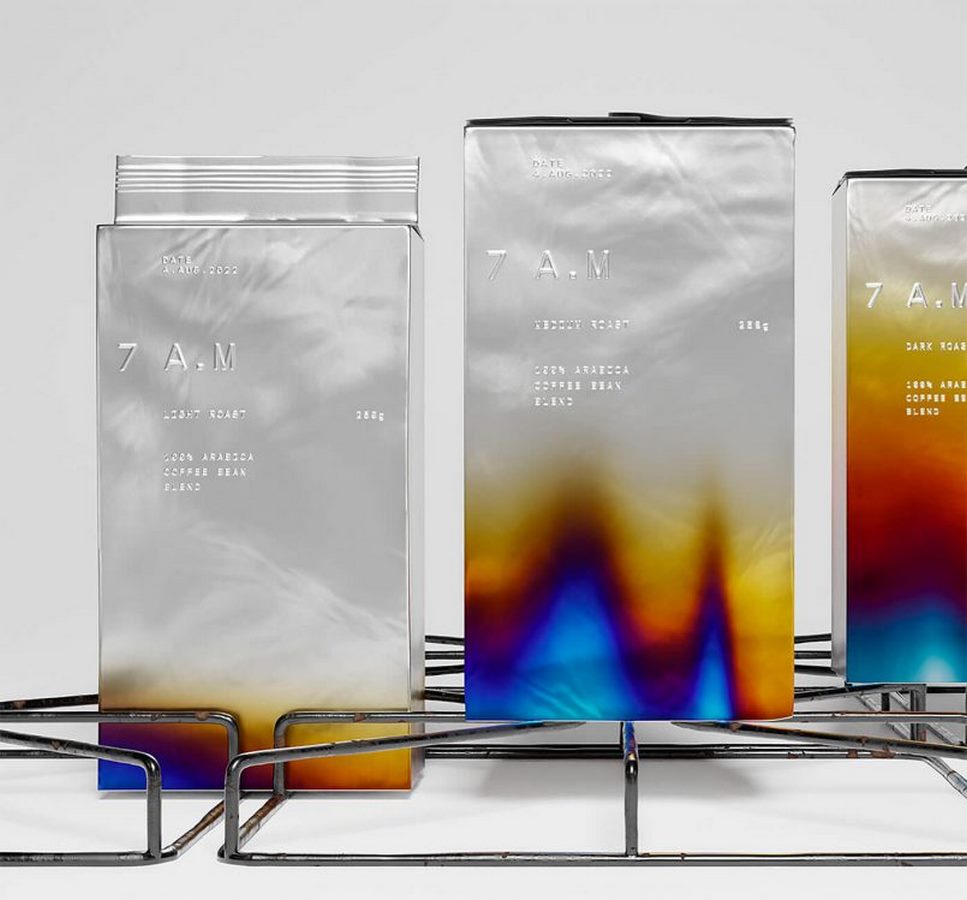
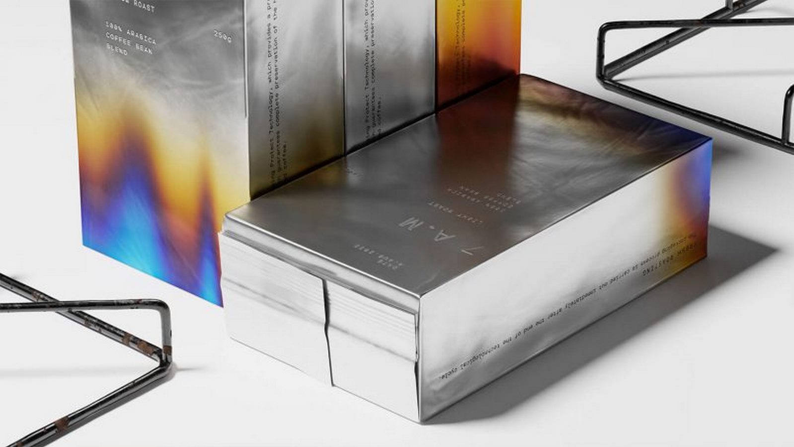
Omsky Studio has unveiled an inspired packaging solution for 7 A.M Coffee, drawing inspiration from the intricate process of roasting coffee beans. With meticulous attention to detail, the studio has crafted a design that mirrors the essence of each coffee’s roast level, ranging from the delicate light roast to the robust dark roast.
Ingenious Gradient Effect
The packaging design ingeniously employs a gradient effect, reminiscent of the charred appearance acquired during the roasting process. This clever utilization of gradients not only adds visual depth but also serves as a visual indicator of the coffee’s intensity. As the roast level intensifies, the color of the packaging deepens, offering consumers a clear visual cue to differentiate between the various roast profiles.

Reflecting Roast Intensity
“The packaging design serves as a reflection of the coffee’s roast intensity – the darker the roast, the richer the color of the packaging,” explains the team at Omsky Studio.

Aesthetic Functionality
By seamlessly blending aesthetics with functionality, Omsky Studio has not only created visually striking packaging but also provided coffee enthusiasts with an intuitive tool to select their preferred roast level with ease. The result is a packaging design that transcends its visual appeal, offering a harmonious blend of artistry and practicality for coffee lovers to savor.

